Simio and Simulation: Modeling, Analysis, Applications - 7th Edition
Chapter 6 Input Analysis
In the simulation models of Chapters 3-5, there were many places where we needed to specify probability distributions for input, as part of the modeling process. In Model 3-3 we said that the demand for hats was a discrete uniform random variable on the integers {1000, 1001, …, 5000}. In Models 3-5, 4-1, and 4-2, we said that interarrival times to the queueing system had an exponential distribution with mean 1.25 minutes, and that service times were exponentially distributed with mean 1 minute; in Models 4-3 and 4-4, we changed that service-time distribution to be triangularly distributed between 0.25 and 1.75 with a mode of 1.00, which is probably a more realistic shape for a service-time distribution than is the exponential (which has a mode of 0). The models in Chapter 5 used exponential, triangular, and uniform input distributions to represent interarrival, processing, inspection, and rework times. And in the models in the chapters to follow there will be many places where we need to specify probability distributions for a wide variety of inputs that are probably best modeled with some uncertainty, rather than as fixed constants. This raises two questions:
How do you specify such input distributions in practice (as opposed to just making them up, which we authors get to do, after some experimentation since we’re trying to demonstrate some ideas and make some points)?
Once you’ve somehow specified these input distributions, how do you “generate” values from them to make your simulation go?
We’ll discuss both in this chapter, but mostly the first question since it’s something that you will have to do as part of model building. The second question is fortunately pretty much covered within simulation software like Simio; still, you need to understand the basics of how those things work so you can properly design and analyze your simulation experiments.
We do assume in this chapter (and for this whole book in general) that you’re already comfortable with the basics of probability and statistics. This includes:
All the probability topics itemized at the beginning of Chapter 2.
Random sampling, and estimation of means, variances, and standard deviations.
Independent and identically distributed (IID) data observations and RVs.
Sampling distributions of estimators of means, variances, and standard deviations.
Point estimation of means, variances, and standard deviations, including the idea of unbiasedness.
Confidence intervals for means and other population parameters, and how they’re interpreted.
Hypothesis tests for means and other population parameters (though we’ll briefly discuss in this chapter a specific class of hypothesis tests we need, goodness-of-fit tests), including the concept of the p-value (a.k.a. observed significance level) of a hypothesis test.
If you’re rusty on any of these concepts, we strongly suggest that you now dust off your old probability/statistics books and spend some quality time reviewing before you read on here. You don’t need to know by heart lots of formulas, nor have memorized the normal or \(t\) tables, but you do need familiarity with the ideas. There’s certainly a lot more to probability and statistics than the above list, like Markov and other kinds of stochastic processes, regression, causal path analysis, data mining, and many, many other topics, but what’s on this list is all we’ll really need.
In Section 6.1 we’ll discuss methods to specify univariate input probability distributions, i.e., when we’re concerned with only one scalar variate at a time, independently across the model. Section 6.2 surveys more generally the kinds of inputs to a simulation model, including correlated, multivariate, and process inputs (one important example of which is a nonstationary Poisson process to represent arrivals with a time-varying rate). In Section 6.3 we’ll go over how to generate random numbers (continuous observations distributed uniformly between 0 and 1), which turns out to be a lot trickier than many people think, and the (excellent) random-number generator that’s built into Simio. Section 6.4 describes how those random numbers are transformed into observations (or realizations or draws) from the probability distributions and processes you decided to use as inputs for your model. Finally, Section 6.5 describes the use of Simio’s Input Parameters and the associated input analysis that they support.
6.1 Specifying Univariate Input Probability Distributions
In this section we’ll discuss the common task of how to specify the distribution of a univariate random variable for input to a simulation. Section 6.1.1 describes our overall tactic, and Section 6.1.2 delineates options for using observed real-world data. Sections 6.1.3 and 6.1.4 go through choosing one or more candidate distributions, and then fitting these distributions to your data; Section 6.1.5 goes into a bit more detail on assessing whether fitted distributions really are a good fit. Section 6.1.6 discusses some general issues in distribution specification.
6.1.1 General Approach
Most simulations will have several places where we need to specify probability distributions to represent random numerical inputs, like the demand for hats, interarrival times, service times, machine up/down times, travel times, or batch sizes, among many other examples. So for each of these inputs, just by themselves, we need to specify a univariate probability distribution (i.e., for just a one-dimensional RV, not multivariate or vector-valued RVs). We also typically assume that these input distributions are independent of each other across the simulation model (though we’ll briefly discuss in Section 6.2.2 the possibility and importance of allowing for correlated or vector-valued random inputs to a simulation model).
For example, in most queueing-type simulations we need to specify distributions for service times, which could represent processing a part at a machine in a manufacturing system, or examining a patient in an urgent-care clinic. Typically we’ll have real-world data on these times, either already available or collected as part of the simulation project. Figure 6.1 shows the first few rows of the Excel spreadsheet file Data_06_01.xls (downloadable from the “students” section of the book’s website as described in Section C.4), which contains a sample of 47 service times, in minutes, one per row in column A. We’ll assume that our data are IID observations on the actual service times, and that they were taken during a stable and representative period of interest. We seek a probability distribution that well represents our observed data, in the sense that a fitted distribution will “pass” statistical goodness-of-fit hypothesis tests, illustrated below. Then, when we run the simulation, we’ll “generate” random variates (observations or samples or realizations of the underlying service-time RV) from this fitted distribution to drive the simulation.
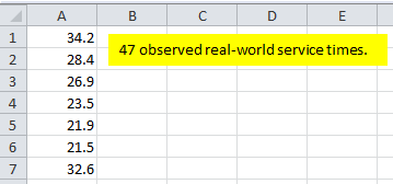
Figure 6.1: Data file with 47 observed service times (in minutes).
6.1.2 Options for Using Observed Real-World Data
You might wonder why we don’t take what might seem to be the more natural approach of just using our observed real-world service times directly by reading them right into the simulation, rather than taking this more indirect approach of fitting a probability distribution, and then generating random variates from that fitted distribution to drive the simulation. There are several reasons:
As you’ll see in later chapters, we typically want to run simulations for a very long time and often repeat them for a large number of IID replications in order to be able to draw statistically valid and precise conclusions from the output, so we’d simply run out of real-world input data in short order.
The observed data in Figure 6.1 and in
Data_06_01.xlsrepresent only what happened when the data were taken at that time. At other times, we would have observed different data, perhaps just as representative, and in particular could have gotten a different range (minimum and maximum) of data. If we were to use our observed data directly to drive the simulation, we’d be stuck with the values we happened to get, and could not generate anything outside our observed range. Especially when modeling service times, large values, even if infrequent, can have great impact on typical queueing congestion measures, like average time in system and maximum queue length, so by “truncating” the possible simulated service times on the right, we could be biasing our simulation results.Unless the sample size is quite large, the observed data could well leave gaps in regions that should be possible but in which we just didn’t happen to get observations that time, so such values could never happen during the simulation.
So, there are several reasons why fitting a probability distribution, and then generating random variates from it to drive the simulation, is often preferred over using the observed real-world data directly. One specific situation where driving the simulation directly from the observed real-world data might be a good idea is in model validation, to assess whether your simulation model accurately reproduces the performance of the real-world system. Doing this, though, would require that you have the output data from the real-world system against which to match up your simulation outputs, which might not be the case if your data-collection efforts were directed at specifying input distributions. However, some recent work ((Song, Nelson, and Pegden 2014), (Song and Nelson 2015)) has shown that there are cases where sampling from sets of observed data is the preferred approach to fitting a probability distribution. We will briefly discuss this topic and the Simio method for sampling from observed data sets in Section 6.5. Our initial job, then, is to figure out which probability distribution best represents our observed data.
6.1.3 Choosing Probability Distributions
Of course, there are many probability distributions from which to choose in order to model random inputs for your model, and you’re probably familiar with several. Common continuous distributions include the normal, exponential, continuous uniform, and triangular; on the discrete side you may be familiar with discrete uniform, binomial, Poisson, geometric, and negative binomial. We won’t provide a complete reference on all these distributions, as that’s readily available elsewhere. The Simio Reference Guide (in Simio itself, tap the F1 key or click the ? icon near the upper right corner) provides basic information on the approximately 20 distributions supported (i.e., which you can specify in your Simio model and Simio will generate random variates from them), via the Simio Reference Guide Contents \(\rightarrow\) Modeling in Simio \(\rightarrow\) Expression Editor, Functions and Distributions \(\rightarrow\) Distributions, to select the distribution you want. Figure 6.2 shows this path on the left, and the gamma-distribution entry on the right, which includes a plot of the PDF (the smooth continuous line since in this case it’s a continuous distribution), a histogram of possible data that might be well fitted by this distribution, and some basic information about it at the top, including the syntax and parameterization for it in Simio. There are also extended discussions and chapters describing probability distributions useful for simulation input modeling, such as (Seila, Ceric, and Tadikamalla 2003) and (Law 2015); moreover, entire multi-volume books (e.g., (Johnson, Kotz, and Balakrishnan 1994), (Johnson, Kotz, and Balakrishnan 1995), (Johnson, Kemp, and Kotz 2005), (Evans, Hastings, and Peacock 2000)) have been written describing in great depth many, many probability distributions. Of course, numerous websites offer compendia of distributions. A search on “probability distributions” returned over 69 million results, such as https:\\en.wikipedia.org\wiki\List_of_probability_distributions; this page in turn has links to web pages on well over 100 specific univariate distributions, divided into categories based on range (or support) for both discrete and continuous distributions, like https:\\en.wikipedia.org\wiki\Gamma_distribution, to take the same gamma-distribution case as in Figure 6.2. Be aware that distributions are not always parameterized the same way, so you need to take care with what matches up with Simio; for instance, even the simple exponential distribution is sometimes parameterized by its mean \(\beta > 0\), as it is in Simio, but sometimes with the rate \(\lambda = 1/\beta\) of the associated Poisson process with events happening at mean rate \(\lambda\), so inter-event times are exponential with mean \(\beta = 1/\lambda\).
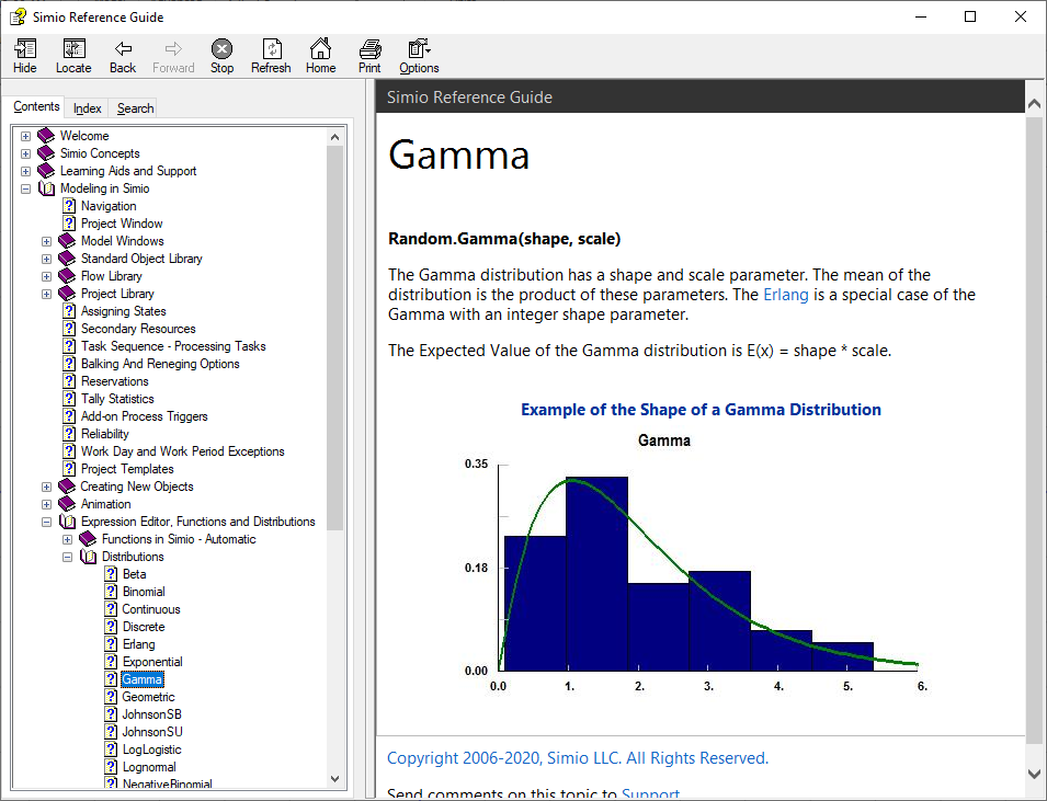
Figure 6.2: Gamma-distribution entry in the Simio Reference Guide.
With such a bewildering array of possibly hundreds of probability distributions, how do you choose one? First of all, it should make qualitative sense. By that we mean several things:
It should match whether the input quantity is inherently discrete or continuous. A batch size should not be modeled as a continuous RV (unless perhaps you generate it and then round it to the nearest integer), and a time duration should generally not be modeled as a discrete RV.
Pay attention to the range of possible values the RV can take on, in particular whether it’s finite or infinite on the right and left, and whether that’s appropriate for a particular input. As mentioned above, whether the right tail of a distribution representing service times is finite or infinite can matter quite a lot for queueing-model results like time (or number) in queue or system.
Related to the preceding point, you should be wary of using distributions that have infinite tails both ways, in particular to the left. This of course includes the normal distribution (though you know it and love it) since its PDF always has an infinite left (and right) tail, so will always extend to the left of zero and will thus always have a positive probability of generating a negative value. This makes no sense for things like service times and other time-duration inputs. Yes, it’s true that if the mean is three or four standard deviations above zero, then the probability of realizing a negative value is small, as basic statistics books call it and sometimes say you can thus just ignore it. The actual probabilities of getting negative values are 0.00134990 and 0.00003167 for, respectively, the mean’s being three and four standard deviations above zero. But remember, this is computer simulation where we could easily generate hundreds of thousands, even millions of random variates from our input probability distributions, so it could well happen that you’ll eventually get a negative one, which, depending on how that’s handled in your simulation when it doesn’t make sense, could create undesired or even erroneous results (Simio actually terminates your run and generates an error message for you if this happens, which is the right thing for it to do). The above two probabilities are respectively about one in 741 and one in 31,574, hardly out of the realm of possibility in simulation. If you find yourself wanting to use the normal distribution due to its shape (and maybe being a good fit to your data), know that there are other distributions, notably the Weibull, that can match the shape of the normal very closely, but have no tail to the left of zero in their PDFs, so have no chance of generating negative values.
So getting discrete vs. continuous right, and the range right, is a first step and will narrow things down.
But still, there could be quite a few distributions remaining from which to choose, so now you need to look for one whose shape (PMF for discrete or PDF for continuous) resembles, at least roughly, the shape of a histogram of your observed real-world data. The reason for this is that the histogram is an empirical graphical estimate of the true underlying PMF or PDF of the data. Figure 6.3 shows a histogram (made with part of the Stat::Fit\(^{(R)}\) distribution-fitting software, discussed more below) of the 47 observed service times from Figure 6.1 and the file Data_06_01.xls. Since this is a service time, we should consider a continuous distribution, and one with a finite left tail (to avoid generating negative values), and perhaps an infinite right tail, in the absence of information placing an upper bound on how large service times can possibly be. Browsing through a list of PDF plots of distributions (such as the Simio Reference Guide cited above and in Simio via the F1 key or the ? icon near the upper right corner), possibilities might be Erlang, gamma (a generalization of Erlang), lognormal, Pearson VI, or Weibull. But each of these has parameters (like shape and scale, for the gamma and Weibull) that we need to estimate; we also need to test whether such distributions, with their parameters estimated from the data, provide an acceptable fit, i.e., an adequate representation of our data. This estimating and goodness-of-fit testing is what we mean by fitting a distribution to observed data.
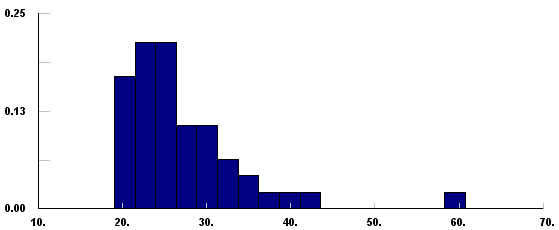
Figure 6.3: Histogram of the observed 47 service-times (in minutes) in data file.
6.1.4 Fitting Distributions to Observed Real-World Data
Since there are several stand-alone third-party packages available that do such distribution fitting and subsequent goodness-of-fit testing, Simio does not provide this capability internally. One such package is Stat::Fit\(^{(R)}\) from Geer Mountain Software Corporation (www.geerms.com), which we chose to discuss in part since it has a free textbook version available for download as described in Appendix C. Another reason we chose Stat::Fit is that it can export the specification of the fitted distribution in the proper parameterization and syntax for simple copy/paste directly into Simio. A complete Stat::Fit manual comes with the textbook-version download as a .pdf file, so we won’t attempt to give a complete description of Stat::Fit’s capabilities, but rather just demonstrate some of its basics. Other packages include the Distribution Fitting tool in @RISK\(^{(R)}\) (Lumivero Corporation, https://lumivero.com/, formerly Palisade Corporation), and ExpertFit\(^{(R)}\) (Averill M. Law & Associates, http://www.averill-law.com).
See Appendix Section C.4.3 for instructions to get and install the textbook version of Stat::Fit.
The Stat::Fit help menu is based on Windows Help, an older system no longer directly supported in Windows Vista or later. The Microsoft web site support.microsoft.com/kb/917607 has a full explanation as well as links to download an operating-system-specific version of WinHlp32.exe that should solve the problem and allow you to gain access to Stat::Fit’s help system. Remember, there’s an extensive .pdf manual included in the same .zip file for Stat::Fit that you can download from this book’s web site.
Figure 6.4 shows Stat::Fit with our service-time data pasted into the Data Table on the left. You can just copy/paste your observed real-world data directly from Excel; only the first 19 of the 47 values present appear, but all 47 are there and will be used by Stat::Fit. In the upper right is the histogram of Figure 6.3, made via the menu path Input \(\rightarrow\) Input Graph (or the Graph Input button on the toolbar); we changed the number of intervals from the default 7 to 17 (Input \(\rightarrow\) Options, or the Input Options button labeled just OPS on the toolbar). In the bottom right window are some basic descriptive statistics of our observed data, made via the menu path Statistics \(\rightarrow\) Descriptive.
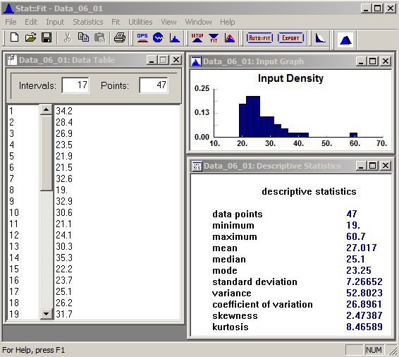
Figure 6.4: Stat::Fit with data file, histogram, and descriptive statistics (data in minutes).
To view PMFs and PDFs of the supported distributions, follow the menu path Utilities \(\rightarrow\) Distribution Viewer and then select among them via the pull-down field in the upper right of that window. Note that the free textbook version of Stat::Fit includes only seven distributions (binomial and Poisson for discrete; exponential, lognormal, normal, triangular, and uniform for continuous) and is limited to 100 data points, but the full commercial version supports 33 distributions and allows up to 8000 observed data points.
We want a continuous distribution to model our service times, and don’t want to allow even a small chance of generating a negative value, so the qualitatively sensible choices from this list are exponential, lognormal, triangular, and uniform (from among those in the free textbook version — the full version, of course, would include many other possible distributions). Though the histogram shape certainly would seem to exclude uniform, we’ll include it anyway just to demonstrate what happens if you fit a distribution that doesn’t fit very well. To select these four distributions for fitting, follow the menu path Fit \(\rightarrow\) Setup, or click the Setup Calculations button (labeled just SETUP) on the toolbar, to bring up the Setup Calculations window. In the Distributions tab (Figure 6.5), click one at a time on the distributions you want to fit in the Distribution List on the left, which copies them one by one to the Distributions Selected list on the right; if you want to remove one from the right, just click on it there.
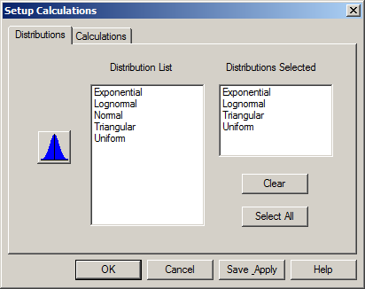
Figure 6.5: Stat::Fit Setup Calculations window, Distributions tab.
The Calculations tab (Figure 6.6) has choices about the method to form the Estimates (MLE, for Maximum Likelihood Estimation, is recommended), and the Lower Bound for the distributions (which you can select as unknown and allow Stat::Fit to choose one that best fits your data, or specify a fixed lower bound if you want to force that). The Calculations tab also allows you to pick the kinds of goodness-of-fit Tests to be done: Chi Squared, Kolmogorov-Smirnov, or Anderson-Darling, and, if you selected the Chi Squared test, the kind of intervals that will be used (Equal Probability is usually best). See Section 6.1.5 for a bit more on assessing goodness of fit; for more detail see (Banks et al. 2005) or (Law 2015).
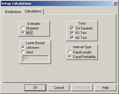
Figure 6.6: Stat::Fit Setup Calculations window, Calculations tab.
The Lower Bound specification requires a bit more explanation. Many distributions, like exponential and lognormal on our list, usually have zero as their customary lower bound, but it may be possible to achieve a better fit to your data with a non-zero lower bound, essentially sliding the PDF left or right (usually right for positive data like service times) to match up better with the histogram of your data. If you select fixed here you can decide yourself where you’d like the lower end of your distribution to start (in which case the field below it becomes active so you can enter your value — the default is the minimum value in your data set, and entering 0 results in the customary lower bound). But if you select unknown here the numerical field becomes inactive since this selection lets Stat::Fit make this determination, which will usually be a bit less than the minimum observation in your data set to get a good fit. Click Save Apply to save and apply all your selections.
To fit the four distributions you chose to represent the service-time data, follow the menu path Fit \(\rightarrow\) Goodness of Fit, or click the Fit Data button (labeled just FIT) in the toolbar, to produce a detailed window of results, the first part of which is in Figure 6.7.
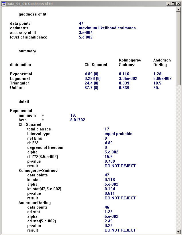
Figure 6.7: Stat::Fit Goodness of Fit results window (detail shown for only the exponential distribution; similar results for the lognormal, triangular, and uniform distributions are below these when scrolling down).
A brief summary is at the top, with the test statistics for all three tests applied to each distribution; for all of these tests, a smaller value of the test statistic indicates a better fit (the values in parentheses after the Chi Squared test statistics are the degrees of freedom). The lognormal is clearly the best fit, followed by exponential, then triangular, and uniform is the worst (largest test statistics).
In the “detail” section further down, you can find, well, details of the fit for each distribution in turn; Figure 6.7 shows these for only the exponential distribution, and the other three distributions’ fit details can be seen by scrolling down in this window. The most important parts of the detail report are the \(p\)-values for each of the tests, which for the fit of the exponential distribution is 0.769 for the Chi Squared test, 0.511 for the Kolmogorov-Smirnov test, and 0.24 for the Anderson-Darling test, with the “DO NOT REJECT” conclusion just under each of them. Recall that the \(p\)-value (for any hypothesis test) is the probability that you would get a sample more in favor of the alternate hypothesis than the sample that you actually got, if the null hypothesis is really true. For goodness-of-fit tests, the null hypothesis is that the candidate distribution adequately fits the data. So large \(p\)-values like these (recall that \(p\)-values are probabilities, so are always between 0 and 1) indicate that it would be quite easy to be more in favor of the alternate hypothesis than we are; in other words, we’re not very much in favor of the alternate hypothesis with our data, so that the null hypothesis of an adequate fit by the exponential distribution appears quite reasonable.
Another way of looking at the \(p\)-value is in the context of the more traditional hypothesis-testing setup, where we pre-choose \(\alpha\) (typically small, between 0.01 and 0.10) as the probability of a Type I error (erroneously rejecting a true null hypothesis), and we reject the null hypothesis if and only if the \(p\)-value is less than \(\alpha\); the \(p\)-values for all three of our tests for goodness of the exponential fit are well above any reasonable value of \(\alpha\), so we’re not even close to rejecting the null hypothesis that the exponential fits well. If you’re following along in Stat::Fit (which you should be), and you scroll down in this window you’ll see that for the lognormal distribution the \(p\)-values of these three tests are even bigger — they show up as 1, though of course they’re really a bit less than 1 before roundoff error, but in any case provide no evidence at all against the lognormal distribution’s providing a good fit. But, if you scroll further on down to the triangular and uniform fit details, the \(p\)-values are tiny, indicating that the triangular and uniform distributions provide terrible fits to the data (as we already knew from glancing at the histogram in the case of the uniform, but maybe not so much for the triangular).
If all you want is a quick summary of which distributions might fit your data and which ones probably won’t, you could just do Fit \(\rightarrow\) Auto::Fit, or click the Auto::fit button in the toolbar, to get first the Auto::Fit dialogue (not shown) where you should select the continuous distributions and lower bound buttons for our service times (since we don’t want an infinite left tail), then OK to get the Automatic Fitting results window in Figure 6.8.
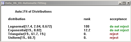
Figure 6.8: Stat::Fit Auto::fit results.
This gives the overall acceptance (or not) conclusion for each distribution, referring to the null hypothesis of an adequate fit, without the \(p\)-values, and in addition the parameters of the fitted distributions (with Stat::Fit’s parameterization conventions, which, as noted earlier, are not universally agreed to, and so in particular may not agree with Simio’s conventions in every case). The rank column is an internal score given by Stat::Fit, with larger ranks indicating a better fit (so lognormal is the best, consistent with the \(p\)-value results from the detailed report).
A graphical comparison of the fitted densities against the histogram is available via Fit \(\rightarrow\) Result Graphs \(\rightarrow\) Density, or the Graph Fit button on the toolbar, shown in Figure 6.9.
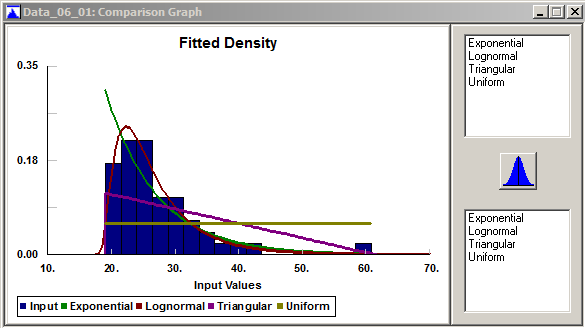
Figure 6.9: Stat::Fit overlays of the fitted densities over the data histogram.
By clicking on the distributions in the upper right you can overlay them all (in different colors per the legend at the bottom); you can get rid of them by clicking in the lower-right window. This provides our favorite goodness-of-fit test, the eyeball test, and provides a quick visual check (so we see just how ridiculous the uniform distribution is for our service-time data, and the triangular isn’t much better).
The final step is to translate the results into the proper syntax for copying and direct pasting into Simio expression fields. This is on File \(\rightarrow\) Export \(\rightarrow\) Export fit, or the Export toolbar button, and brings up the EXPORT FIT dialog shown in Figure 6.10.
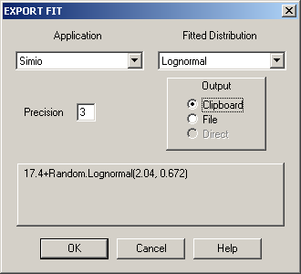
Figure 6.10: Stat::Fit EXPORT FIT dialogue.
The top left drop-down contains a list of several simulation-modeling packages, Simio among them, and the top right drop-down shows the distributions you’ve fit. Choose the distribution you want, let’s say the fitted lognormal, then select the Clipboard radio button just below and see the valid Simio expression 17.4+Random.Lognormal(2.04, 0.672) in the panel below. This expression now occupies the Windows clipboard, so if you go into the Simio application at this point and paste CTRL-V into an expression field that accepts a probability distribution, you’re done. Note that Stat::Fit is recommending that we shift the lognormal distribution up (to the right) by 17.4 in order to get a better fit to our data, rather than stay with the customary lower end of zero for the lognormal distribution; this shift value of 17.4 is a little less than the minimum value of 19.0 in the data set, so that the fitted lognormal density function will “hit zero” on the left just a bit to the left of the minimum data value (so when generating variates, the smallest possible value will be 17.4).
You can save all your Stat::Tools work, including the data, distribution selection, results, and graphics. As usual, do File \(\rightarrow\) Save or Save As, or the usual Save button. The default filename extension is .sfp (for Stat::Fit Project); we chose the file name Data_06_01.sfp.
6.1.5 More on Assessing Goodness of Fit
In Section 6.1.4 we gave an overview of fitting distributions to data with Stat::Fit, and testing how well the various candidate distributions do in terms of representing our observed data set. There are many ways to assess goodness of fit, far more than we can cover in depth; see (Banks et al. 2005) or (Law 2015) for more detail. But in this section we’ll describe what’s behind some of the main methods we described above, including formal hypothesis tests as well as informal visual heuristics. We won’t treat the Anderson-Darling test; see (Banks et al. 2005) or (Law 2015).
6.1.5.1 Chi-Squared Goodness-of-Fit Test
In Figure 6.9, what we’re looking for in a good fit is good (or at least reasonable) agreement between the histogram (the blue bars) and the PDFs of the fitted distributions (the lines of various colors in the legend at the bottom); for this discussion we’ll assume we’re fitting a continuous distribution. While this desire is intuitive, there’s also a mathematical reason for it.
Let \(n\) be the number of real-world observed data points (so \(n = 47\) in our example), and let \(k\) be the number of intervals defining the histogram along the horizontal axis (so \(k\) = 17 in our example); for now, we’ll assume that the intervals are all of equal width \(w\) as they would be in a histogram, though they don’t need to be for the chi-squared test, and in many cases they shouldn’t be \(\ldots\) more on that below. Let the left endpoints of the \(k\) intervals be denoted \(x_0, x_1, x_2, \ldots, x_{k-1}\) and let \(x_k\) be the right endpoint of the \(k\)th interval, so the \(j\)th interval is \(\left[x_{j-1}, x_j\right)\) for \(j = 1, 2, \ldots, k\). If \(O_j\) of our \(n\) observations fall in the \(j\)th interval (the observed frequency of the data in that interval), then \(O_j/n\) is the proportion of the data falling into the \(j\)th interval.
Now, let \(\widehat{f}(x)\) be the PDF of the fitted distribution under consideration. If this is really the right PDF to represent the data, then the probability that a data point in our observed sample falls in the \(j\)th interval \(\left[x_{j-1}, x_j\right)\) would be \[p_j = \int_{x_{j-1}}^{x_j} \widehat{f}(x) dx,\] and this should be (approximately) equal to the observed proportion \(O_j/n\). So if this is actually a good fit, we would expect \(O_j/n \approx p_j\) for all intervals \(j\). Multiplying this through by \(n\), we would expect that \(O_j \approx np_j\) for all intervals \(j\), i.e., the observed and expected (if \(\widehat{f}\) really is the right density function for our data) frequencies within the intervals should be “close” to each other; if they’re in substantial disagreement for too many intervals, then we would suspect a poor fit. This is really what our earlier eyeball test is doing. But even in the case of a really good fit, we wouldn’t demand \(O_j = n p_j\) (exactly) for all intervals \(j\), simply due to natural fluctuation in random sampling. To formalize this idea, we form the chi-squared test statistic \[\chi^2_{k-1} = \sum_{j=1}^{k}\frac{\left( O_j - np_j \right)^2}{n p_j},\] and under the null hypothesis \(H_0\) that the observed data follow the fitted distribution \(\widehat{f}\), \(\chi^2_{k-1}\) has (approximately (more precisely, asymptotically, i.e., as \(n \rightarrow \infty\).})\index{Asymptotically Valid) a chi-squared distribution with \(k-1\) degrees of freedom. So we’d reject the null hypothesis \(H_0\) of a good fit if the value of the test statistic \(\chi^2_{k-1}\) is “too big” (or inflated as it’s sometimes called). How big is “too big” is determined by the chi-squared tables: for a given size \(\alpha\) of the test, we’d reject \(H_0\) if \(\chi^2_{k-1} > \chi_{k-1,1-\alpha}^2\) where \(\chi_{k-1,1-\alpha}^2\) is the point above which is probability \(\alpha\) in the chi-squared distribution with \(k-1\) degrees of freedom. The other way of stating the conclusion is to give the \(p\)-value of the test, which is the probability above the test statistic \(\chi^2_{k-1}\) in the chi-squared distribution with \(k-1\) degrees of freedom; as usual with \(p\)-values, we reject \(H_0\) at level \(\alpha\) if and only if the \(p\)-value is less that \(\alpha\).
Note that the value of the test statistic \(\chi^2_{k-1}\), and perhaps even the conclusion of the test, depends on the choice of the intervals. How to choose these intervals is a question that has received considerable research, but there’s no generally accepted “right” answer. If there is consensus, it’s that (1) the intervals should be chosen equiprobably, i.e., so that the probability values \(p_j\) of the integrals are equal to each other (or at least approximately so), and (2) so that \(np_j\) is at least (about) 5 for all intervals \(j\) (the latter condition is basically to discourage use of the chi-squared goodness-of-fit test if the sample size is quite small). One way to find the endpoints of equiprobable intervals is to set \(x_j = \widehat{F}^{-1}(j/k)\), where \(\widehat{F}\) is the CDF of the fitted distribution, and the superscript \(-1\) denotes the functional inverse (not the arithmetic reciprocal); this entails solving the equation \(\widehat{F}(x_j) = j/k\) for \(x_j\), which may or may not be straightforward, depending on the form of \(\widehat{F}\), and so may require use of a numerical-approximation root-finding algorithm like the secant method or Newton’s method.
The chi-squared goodness-of-fit test can also be applied to fitting a discrete distribution to a data set whose values must be discrete (like batch sizes). In the foregoing discussion, \(p_j\) is just replaced by the sum of the fitted PMF values within the \(j\)th interval, and the procedure is the same. Note that for discrete distributions it will generally not be possible to attain exact equiprobability on the choice of the intervals.
6.1.5.2 Kolmogorov-Smirnov Goodness-of-Fit Test
While chi-squared tests amount to comparing the fitted PDF (or PMF in the discrete case) to an empirical PDF or PMF (a histogram), Kolmogorov-Smirnov (K-S) tests compare the fitted CDF to a certain empirical CDF defined directly from the data. There are different ways to define empirical CDFs, but for this purpose we’ll use \(F_{\mbox{emp}}(x)\) = the proportion of the observed data that are \(\leq x\), for all \(x\); note that this is a step function that is continuous from the right, with a step of height \(1/n\) occurring at each of the (ordered) observed data values. As before, let \(\widehat{F}(x)\) be the CDF of a particular fitted distribution. The K-S test statistic is then the largest vertical discrepancy between \(F_{\mbox{emp}}(x)\) and \(\widehat{F}(x)\) along the entire range of possible values of \(x\); expressed mathematically, this is \[V_n = \sup_x \left|F_{\mbox{emp}}(x) - \widehat{F}(x)\right|,\] where “sup” is the supremum, or the least upper bound across all values of \(x\). The reason for not using the more familiar max (maximum) operator is that the largest vertical discrepancy might occur just before a “jump” of \(F_{\mbox{emp}}(x)\), in which case the supremum won’t actually be attained exactly at any particular value of \(x\).
A finite (i.e., computable) algorithm to evaluate the K-S test statistic \(V_n\) is given in (Law 2015). Let \(X_1, X_2, \ldots, X_n\) denote the observed sample, and for \(i = 1, 2, \ldots, n\) let \(X_{(i)}\) denote the \(i\)th smallest of the data values (so \(X_{(1)}\) is the smallest observation and \(X_{(n)}\) is the largest observation); \(X_{(i)}\) is called the \(i\)th order statistic of the observed data. Then the K-S test statistic is \[V_n = \max\left\{\ \ \max_{i = 1, 2, \ldots, n}\left[ \frac{i}{n} - \widehat{F}(X_{(i)}) \right],\ \ \max_{i = 1, 2, \ldots, n}\left[ \widehat{F}(X_{(i)}) - \frac{i-1}{n} \right]\ \ \right\}. \]
It’s intuitive that the larger \(V_n\), the worse the fit. To decide how large is too large, we need tables or reference distributions for critical values of the test for given test sizes \(\alpha\), or to determine \(p\)-values of the test. A disadvantage of the K-S test is that, unlike the chi-squared test, the K-S test needs different tables (or reference distributions) for different hypothesized distributions and different sample sizes \(n\) (which is why we include \(n\) in the notation \(V_n\) for the K-S test statistic); see (Gleser 1985) and (Law 2015) for more on this point. Distribution-fitting packages like Stat::Fit include these reference tables as built-in capabilities that can provide \(p\)-values for K-S tests. Advantages of the K-S test over the chi-squared test are that it does not rely on a somewhat arbitrary choice of intervals, and it is accurate for small sample sizes \(n\) (not just asymptotically, as the sample size \(n \rightarrow \infty\)).
In Stat::Fit, the menu path Fit \(\rightarrow\) Result Graphs \(\rightarrow\) Distribution produces the plot in Figure 6.11with the empirical CDF in blue, and the CDFs of various fitted distributions in different colors per the legend at the bottom; adding/deleting fitted distributions works as in Figure 6.9. While the K-S test statistic is not shown in Figure 6.11 (for each fitted distribution, imagine it as the height of vertical bar at the worst discrepancy between the empirical CDF and that fitted distribution), it’s easy to see that the uniform and triangular CDFs are very poor matches to the empirical CDF in terms of the largest vertical discrepancy, and that the lognormal is a much better fit (in fact, it’s difficult to distinguish it from the empirical CDF in Figure 6.11).
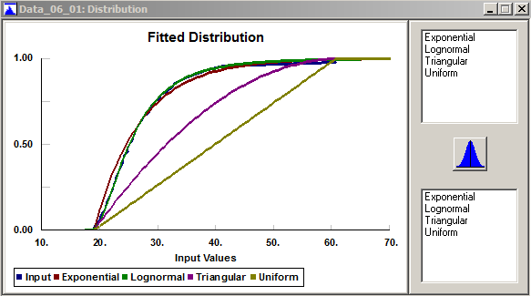
Figure 6.11: Stat::Fit overlays of the fitted CDFs over the empirical distribution.
6.1.5.3 P-P Plots
Let’s assume for the moment that the CDF \(\widehat{F}\) of a fitted distribution really is a good fit to the true underlying unknown CDF of the observed data. If so, then for each \(i = 1, 2, \ldots, n\), \(\widehat{F}(X_{(i)})\) should be close to the empirical proportion of data points that are at or below \(X_{(i)}\). That proportion is \(i/n\), but just for computational convenience we’d rather stay away from both 0 and 1 in that proportion (for fitted distributions with an infinite tail), so we’ll make the small adjustment and use \((i-1)/n\) instead for this empirical proportion. To check out heuristically (not a formal hypothesis test) whether \(\widehat{F}\) actually is a good fit to the data, we’ll gauge whether \((i-1)/n \approx \widehat{F}(X_{(i)})\) for \(i = 1, 2, \ldots, n\), by plotting the points \(\left((i-1)/n, \widehat{F}(X_{(i)})\right)\) for \(i = 1, 2, \ldots, n\); if we indeed have a good fit then these points should fall close to a diagonal straight line from \((0, 0)\) to \((1, 1)\) in the plot. Since both the \(x\) and \(y\) coordinates of these points are probabilities (empirical and fitted, respectively), this is called a probability-probability plot, or a P-P plot.
In Stat::Fit, P-P plots are available via the menu path Fit \(\rightarrow\) Result Graphs \(\rightarrow\) PP Plot, to produce Figure 6.12 for our 47-point data set and our four trial fitted distributions. As in Figures 6.9 and 6.11, you can add fitted distributions by clicking them in the upper right box, and remove them by clicking them in the lower right box. The P-P plot for the lognormal fit appears quite close to the diagonal line, signaling a good fit, and the P-P plots for the triangular and uniform fits are very far from the diagonal, once again signaling miserable fits for those distributions. The exponential fit appears not unreasonable, though not as good as the lognormal.
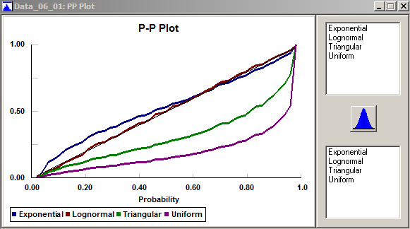
Figure 6.12: Stat::Fit P-P plots.
6.1.5.4 Q-Q Plots
The idea in P-P plots was to see whether \((i-1)/n \approx \widehat{F}(X_{(i)})\) for \(i = 1, 2, \ldots, n\). If we apply \(\widehat{F}^{-1}\) (the functional inverse of the CDF \(\widehat{F}\) of the fitted distribution) across this approximate equality, we get \(\widehat{F}^{-1}\left((i-1)/n\right) \approx X_{(i)}\) for \(i = 1, 2, \ldots, n\), since \(\widehat{F}^{-1}\) and \(\widehat{F}\) “undo” each other. Here, the left-hand side is a quantile of the fitted distribution (value below which is a probability or proportion, in this case \((i-1)/n\)). Note that a closed-form formula for \(\widehat{F}^{-1}\) may not be available, mandating a numerical approximation. So if \(\widehat{F}\) really is a good fit to the data, and we plot the points \(\left(\widehat{F}^{-1}\left((i-1)/n\right), X_{(i)}\right)\) for \(i = 1, 2, \ldots, n\), we should again get an approximately straight diagonal line, but not between \((0, 0)\) and \((1, 1)\), but rather between \(\left(X_{(1)}, X_{(1)}\right)\) and \(\left(X_{(n)}, X_{(n)}\right)\). (Actually, Stat::Fit reverses the order and plots the points \(\left(X_{(i)}, \widehat{F}^{-1}\left((i-1)/n\right)\right)\), but that doesn’t change the fact that we’re looking for a straight line.) Now, both the \(x\) and \(y\) coordinates of these points are quantiles (fitted and empirical, respectively), so this is called a quantile-quantile plot, or a Q-Q plot.
You can make Q-Q plots in Stat::Fit via Fit \(\rightarrow\) Result Graphs \(\rightarrow\) QQ Plot, to produce Figure 6.13 for our data and our fitted distributions. As in Figures 6.9, 6.11, and 6.12, you can choose which fitted distributions to display. The lognormal and exponential Q-Q plots appear to be the closest to the diagonal line, signaling a good fit, except in the right tail where neither does well. The Q-Q plots for the triangular and uniform distributions indicate very poor fits, consistent with our previous findings. According to (Law 2015), Q-Q plots tend to be sensitive to discrepancies between the data and fitted distributions in the tails, whereas P-P plots are more sensitive to discrepancies through the interiors of the distributions.
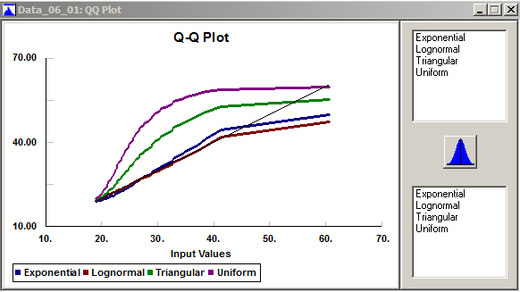
Figure 6.13: Stat::Fit Q-Q plots.
6.1.6 Distribution-Fitting Issues
In this section we’ll briefly discuss a few issues and questions that often arise when trying to fit distributions to observed data.
6.1.6.1 Are My Data IID? What If They Aren’t?
A basic and important assumption underlying all the distribution-fitting methods and goodness-of-fit testing discussed in Sections 6.1.3–6.1.5 is that the real-world data observed for a model input are IID: Independent and Identically Distributed. As a point of logic, this is really two assumptions, both of which must hold if the methods in Sections 6.1.3-6.1.5 are to be valid:
“I”: Each data point is probabilistically/statistically independent of any other data point in your data set. This might be suspect if the data were sequentially collected on a process over time (as might often be the case) where an observation has some kind of relationship with the next or later observations, either a “physical” causal relationship or an apparent statistical-correlation relationship.
“ID”: The underlying probability distribution or process giving rise to the data is the same for each data point. This might be suspect if the conditions during data collection changed in a manner that could affect the data’s underlying distribution, or if there is heterogeneity in the data set in terms of the sources of the observations.
It’s always good to have a contextual understanding of the system being modeled, and of the way in which the data were collected. While there are formal statistical tests for both the “I” and “ID” in IID, we’ll focus on a few simple graphical methods to check these assumptions informally, and where possible, suggest courses of action if either assumptions appears unwarranted from the data.
As before, let \(X_1, X_2, \ldots, X_n\) denote the observed data, but now suppose that the subscript \(i\) is the time-order of observation, so \(X_1\) is the first observation in time, \(X_2\) is the second observation in time, etc. An easy first step to assess IID-ness is simply to make a time-series plot of the data, which is just a plot of \(X_i\) on the vertical axis vs. the corresponding \(i\) on the horizontal axis; see Figure 6.14, which is for the 47 service times we considered in Sections 6.1.1–6.1.5. This plot is in the Excel spreadsheet file Data_06_02.xls; the original data from Data_06_01.xls are repeated in column B, with the time-order of observation \(i\) added in column A (ignore the other columns for now). For IID data, this plot should look rather like an amorphous and uninteresting cloud of points, without apparent visible persistent trends up or down or periodicities (which could happen if the “ID” is violated and the distribution is drifting or cycling over time), or strong systematic connections between successive points (which could happen if the “I” is violated), which seems to be the case for these data.
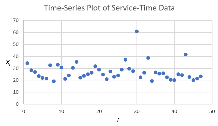
Figure 6.14: Time-series plot of the 47 service times.
Another easy plot, more specifically aimed at detecting non-independence between adjacent observations in the data (called lag-1 in the time series of collection), is a scatter plot of the adjacent pairs \((X_i, X_{i+1})\) for \(i = 1, \ldots, n-1\); for the 47 service times see Figure 6.15, which is also in Data_06_02.xls (to make this plot in Excel we needed to create the new column C for \(X_{i+1}\) for \(i = 1, \ldots, n-1\)). If there were a lag-1 positive correlation the points would cluster around an upward-sloping line (negative correlation would result in a cluster around a downward-sloping line), and independent data would not display such clustering, as appears to be the case here. Stat::Fit can also make such lag-1 scatterplots of a data set via the menu path Statistics \(\rightarrow\) Independence \(\rightarrow\) Scatter Plot. If you want to check for possible non-independence at lag \(k > 1\), you can of course make similar plots except plotting the pairs \((X_i, X_{i+k})\) for \(i = 1, \ldots, n-k\) (Stat::Fit doesn’t do this, but you could fashion your own plots in Excel).
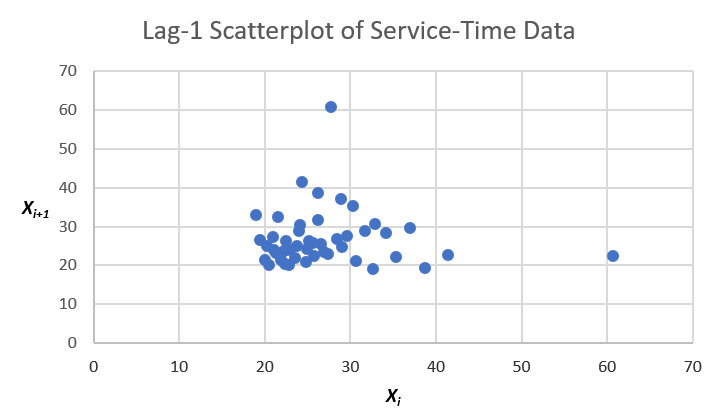
Figure 6.15: Scatter plot (at Lag 1) for the 47 service times.
Time-series and scatter plots can provide good intuitive visualization of possible lack of independence, but there are numerical diagnostic measures as well. Perhaps most obvious is to construct a correlation matrix showing the numerical autocorrelation (_auto_correlation since it’s within the same data sequence) estimates at various lags; we’ll do lags 1 through 3. Most standard statistical-analysis packages can do this automatically, but we can do it in Excel as well. Figure 6.16 shows columns A–E of Data_06_02.xls, except that rows 9–43 are hidden for brevity, and you can see that columns C, D, and E are the original data from column B except shifted up by, respectively, 1, 2, and 3 rows (representing lags in the time-order of observation).
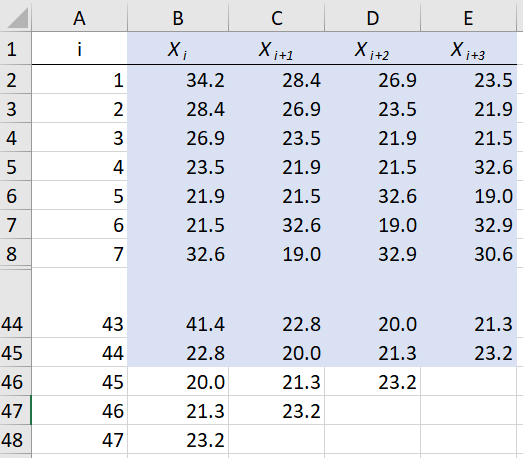
Figure 6.16: Data-column arrangement for autocorrelation matrix in data file.
To make the autocorrelation matrix, use the Excel Data Analysis package, via the Data tab at the top and then the Analyze area on the right (if you don’t see the Data Analysis icon there, you need to load the Analysis ToolPak add-in via the File tab at the top, then Options on the bottom left to get the Excel Options window, then Add-ins on the left menu, and finally Manage Excel Add-ins at the bottom). Once you’re in the Data Analysis window, select Correlation, then OK, then select the input range $B$1:$E$45 (the blue-shaded cells, noting that we had to omit the last three rows since we want autocorrelations through lag 3), check the box for Labels in First Row, and then where you’d like the output to go (we selected Output Range $G$37). Figure 6.17 shows the results.
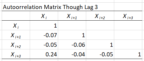
Figure 6.17: Autocorrelation matrix in data file.
There are actually three estimates of the lag-1 autocorrelation (down the diagonal from upper left to lower right), \(-0.07\), \(-0.06\), and \(-0.05\) that are very close to each other since they are using almost the same data (except for a few data points at the ends of the sequence), and are all very small (remember that correlations always fall between \(-1\) and \(+1\)). Similarly, there are two estimates of the lag-2 autocorrelation, \(-0.05\) and \(-0.04\), again very close to each other and very small. The single estimate of the lag-3 autocorrelation, \(+0.24\), might indicate some positive relation between data points three observations apart, but it’s weak in any case (we’re not addressing here whether any of these autocorrelation estimates are statistically significantly different from zero). A visual depiction of the autocorrelations is possible via a plot (called a correlogram, or in this case within a single data sequence an autocorrelogram) with the lag (1, 2, 3, etc.) on the horizontal axis and the corresponding lagged autocorrelation on the vertical axis; Stat::Fit does this via the menu path Statistics \(\rightarrow\) Independence \(\rightarrow\) Autocorrelation, with the result in Figure 6.18 indicating the same thing as did the autocorrelation matrix.
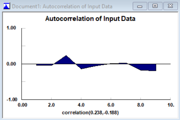
Figure 6.18: Autocorrelation plot via Stat::Fit in data file.
There are also many formal statistical hypothesis tests for independence within a data set. Among these are various kinds of runs tests, that look in a data sequence for runs of the data, which are a subsequences of data points that go only up (or down), and in truly independent data the expected length and frequency of such runs can be computed, against which the length and frequency of runs in the data are compared for agreement (or not). Stat::Fit supports two other runs tests (above/below median and turning points), via the menu path Statistics \(\rightarrow\) Independence \(\rightarrow\) Runs Test (we’ll leave it to you to try this out).
So it appears that the independence assumption for our 47 service times is at least plausible, having found no strong evidence to the contrary. Finding that your data are clearly not independent mandates some alternative course of action on your part, either in terms of modeling or further data collection. One important special case of this in simulation is a time-varying arrival pattern, which we discuss below in Section 6.2.3, and modeling this is well-supported by Simio. But in general, modeling non-independent input process in simulation is difficult, and beyond the scope of this book; the interested reader might peruse the time-series literature (such as (Box, Jenkins, and Reinsel 1994)), for examples of methods for fitting various kinds of autoregressive processes, but generating them is generally not supported in simulation software.
Having focused on the “I” (Independent) assumption so far, let’s now consider the “ID” (Identically Distributed) assumption. Deviations from this assumption could be due to a heterogeneous data set, such as service times provided by several different operators with different levels of training and skill. This is sometimes detected by noting several distinct modes (peaks) in the histogram of all the service times merged together. A good way to deal with this is to try to track down which service times were provided by which operator, and then alter the simulation model to have distinct server resources, with different distributions for service times, and use appropriate and different distributions for their service times depending on their training or skill. Another example is in simulation of a hospital emergency department, where patients arrive with different acuities (severities) in their conditions, and the various service times during their stay could well depend on their acuity, so we would need different service-time distributions for different acuities. Deviations from the “ID” assumption could also happen if the distribution changes over time; in this case we could try to identify the change points (either from physical knowledge of the system, or from the data themselves) and alter the simulation model to use different distributions during different time periods.
6.1.6.2 What If Nothing Fits?
The process just described in Section 6.1.4 is a kind of best-case scenario, and things don’t always go so smoothly. It can definitely happen that, despite your (and Stat::Fit’s) best efforts to find a standard distribution that fits your data, alas, all your \(p\)-values are small and you reject all your distributions’ fits. Does this mean that your data are unacceptable or have somehow failed? No, on the contrary, it means that the “standard” list of distributions fails to have an entry that accommodates your data (which, after all, are “The Truth” about the phenomenon being observed, like service times — the burden is on the distributions to mold themselves to your data, not the other way around).
In this case, Stat::Fit can produce an empirical distribution, which is basically just a version of the histogram, and variates can be generated from it in the Simio simulation. On the Stat::Fit menus, do File \(\rightarrow\) Export \(\rightarrow\) Export Empirical, and select the Cumulative radio button (rather than the default Density button) for compatibility with Simio. This will copy onto the Windows clipboard a sequence of pairs \(v_i, c_i\) where \(v_i\) is the \(i\)th smallest of your data values, and \(c_i\) is the cumulative probability of generating a variate that is less than or equal to the corresponding \(v_i\). Exactly what happens after you copy this information into Simio depends on whether you want a discrete or continuous distribution. In the Simio Reference Guide (F1 or ? icon from within Simio), follow the Contents-tab path Modeling in Simio \(\rightarrow\) Expression Editor, Functions and Distributions \(\rightarrow\) Distributions, then select either Discrete or Continuous according to which you want:
If Discrete, the proper Simio expression is
Random.Discrete(v1, c1, v2, c2, ...)where the sequence of pairs can go on as long as needed according to your data set, and you’ll generate each value \(v_i\) with cumulative probability \(c_i\) (e.g., the probability is \(c_4\) that you’ll generate a value less than or equal to \(v_4\), so you’ll generate a value equal to \(v_4\) with probability \(c_4 - c_3\)).If Continuous, the Simio expression is
Random.Continuous(v1, c1, v2, c2, ...), and the CDF from which you’ll generate will pass through each \((v_i, c_i)\) and will connect them with straight lines, so it will be a piecewise-linear “connect-the-dots” CDF rising from 0 at \(v_1\) to 1 at the largest (last) \(v_i\).
Note that in both the discrete and continuous cases, you’ll end up with a distribution that’s bounded both below (by your minimum data point) and above (by your maximum data point), i.e., it does not have an infinite tail in either direction.
Another approach to the “nothing fits” problem is afforded by Simio’s feature that allows drawing samples directly from a data table. Essentially you import the entire set of sample data into a Simio data table, then use an Input Parameter to draw random samples from the table. Refer to Section 6.5 to learn more about using Input Parameters based on Table Values.
6.1.6.3 What If I Have No Data?
Obviously, this is not a good situation. What people usually do is ask an “expert” familiar with the system (or similar systems) for, say, lowest and highest values that are reasonably possible, which then specify a uniform distribution. If you feel that uniform gives too much weight toward the extremes, you could instead use a triangular distribution with a mode (peak of the PDF, not necessarily the mean) that may or may not be in the middle of the range, depending on the situation. Once you’ve done such things and have a model working, you really ought to use your model as a sensitivity-analysis tool (see “What’s the Right Amount of Data?” just below) to try to identify which inputs matter most to the output, and then try very hard to get some data on at least those important inputs, and try to fit distributions. Simio’s Input Parameters feature, discussed in Section 6.5, may also provide guidance on which inputs matter most to key output performance metrics.
6.1.6.4 What If I Have “Too Much” Data?
Another extreme situation is when you have a very large sample size of observed real-world data of maybe thousands. Usually we’re happy to have a lot of data, and really, we are here too. We just have to realize that, with a very large sample size, the goodness-of-fit hypothesis tests will have high statistical power (probability of rejecting the null hypothesis when it’s really false, which strictly speaking, it always is), so it’s likely that we’ll reject the fits of all distributions, even though they may look perfectly reasonable in terms of the eyeball test. In such cases, we should remember that goodness-of-fit tests, like all hypothesis tests, are far from perfect, and we may want to go ahead and use a fitted distribution anyway even if goodness-of-fit tests reject it with a large sample size, provided that it passes the eyeball test.
6.1.6.5 What’s the Right Amount of Data?
Speaking of sample size, people often wonder how much real-world data they need to fit a distribution. Of course, there’s no universal answer possible to such a question. One way to address it, though, is to use your simulation model itself as a sensitivity-analysis tool to gauge how sensitive some key outputs are to changes in your input distributions. Now you’re no doubt thinking “but I can’t even build my model if I don’t know what the input distributions are,” and strictly speaking, you’re right. However, you could build your model first, before even collecting real-world data to which to fit input probability distributions, and initially just use made-up input distributions — not arbitrary or crazy distributions, but in most cases you can make a reasonable guess using, say, simple uniform or triangular input distributions and someone’s general familiarity with the system. Then vary these input distributions to see which ones have the most impact on the output — those are your critical input distributions, so you might want to focus your data collection there, rather than on other input distributions that seem not to affect the output as much. As in the no-data case discussed above, Simio’s Input Parameters feature in Section 6.5 may also provide guidance as to how much relative effort should be expended collecting real-world data on your model’s various inputs.
6.1.6.6 What’s the Right Answer?
A final comment is that distribution specification is not an exact science. Two people can take the same data set and come up with different distributions, both of which are perfectly reasonable, i.e., provide adequate fits to the data, but are different distributions. In such cases you might consider secondary criteria, such as ease of parameter manipulation to effect changes in the distributions’ means. If that’s easier with one distribution than the other, you might go with the easier one in case you want to try different input-distribution means (e.g., what if you had a server that was 20% faster on average?).
6.2 Types of Inputs
Having discussed univariate distribution fitting in Section 6.1, we should now take a step back and think more generally about all the different kinds of numerical inputs that go into a simulation model. We might classify these along two dimensions in a \(2 \times 3\) classification: deterministic vs. stochastic, and scalar vs. multivariate vs. stochastic processes.
6.2.1 Deterministic vs. Stochastic
Deterministic inputs are just constants, like the number of automated check-in kiosks a particular airline has at a particular airport. This won’t change during the simulation run — unless, of course, the kiosks are subject to breakdowns at random points in time, and then have to undergo repair that lasts a random amount of time. Another example of deterministic input might be the pre-scheduled arrival times of patients to a dental office.
But wait, have you never been late (or early) to a dental appointment? So arrival times might be more realistically modeled as the (deterministic) scheduled time, plus a deviation RV that could be positive for a late arrival and negative for an early arrival (and maybe with expected value zero if we assume that patients are, on average, right on time, even if not in every case). This would be an example of a stochastic input, which involves (or just is) a RV. Actually, for this sort of a situation it’s more common to specify a distribution for the interarrival times, as we did in the spreadsheet-imprisoned queueing Model 3-3. Note that Simio provides exactly this feature with a Source object using an Arrival Type of Arrival Table.
Often, a given input to a simulation might arguably be either deterministic or stochastic:
The walking time of a passenger in an airport from the check-in kiosk to security. The distances are the same for everybody, but walking speeds clearly vary.
The number of items actually in a shipment, as opposed to the (deterministic) number ordered.
The time to stamp and cut an item at a machine in a stamping plant. This could be close to deterministic if the sheet metal off the roll is pulled through at a constant rate, and the raising/dropping of the stamping die is at a constant rate. Whether to try to model small variations in this using RVs would be part of the question of level of detail in model building (by the way, more detail doesn’t always lead to a “better” model).
The time to do a “routine” maintenance on a military vehicle. While what’s planned could be deterministic, we might want to model the extra (and random) time needed if more problems are uncovered.
Whether to model an input as deterministic or stochastic is a modeling decision. It’s obvious that you should do whichever matches the real system, but there still could be questions about whether it matters to the simulation output. Note: In Appendix 12 we will see how a given input might be deterministic during the planning phase and stochastic during the risk analysis phase.
6.2.2 Scalar vs. Multivariate vs. Stochastic Processes
If an input is just a single number, be it deterministic or stochastic, it’s a scalar value. Another term for this, used especially if the scalar is stochastic, is univariate. This is most commonly how we model inputs to simulations — one scalar number (or RV) at a time, typically with several such inputs across the model — and typically assumed to be statistically independent of each other. Our discussion in Section 6.1 tacitly assumed that our model is set up this way, with all stochastic inputs being univariate and independent of each other across the model. In a manufacturing model, such scalar univariate inputs could include the time for processing a part, and the time for subsequent inspection of it. And in an urgent-care clinic, such scalar univariate inputs might include interarrival times between successive arriving patients, their age, gender, insurance status, time taken in an exam room, diagnosis code, and disposition code (like go home, go to a hospital emergency room in a private car, or call for an ambulance ride to a hospital).
But there could be relationships between the different inputs across a simulation model, in which case we really should view them as components (or coordinates) of an input vector, rather than being independent; if some of these components are random, then this is called a random vector, or a multivariate distribution. Importantly, this allows for dependence and correlation across the coordinates of the input random vector, making it a more realistic input than if the coordinates were assumed to be independent — and this can affect the simulation’s output. In the manufacturing example of the preceding paragraph, we could allow, say, positive correlation between a given part’s processing and inspection times, reflecting the reality that some parts are bigger or more problematic than are other parts. It would also allow us to prevent generating absurdities in the urgent-care clinic like a young child suffering from arthritis (unlikely), or an elderly man with complications from pregnancy (beyond unlikely), both of which would be possible if all these inputs were generated independently, which is typically what we do. Another example is a fire-department simulation, where the number of fire trucks and ambulances sent out on a given call should be positively correlated (large fires could require several of each, but small fires perhaps just one of each); see (Mueller 2009) for how this was modeled and implemented in one project. While some such situations can be modeled just logically (e.g., for the health-care clinic, first generate gender and then do the obvious check before allowing a pregnancy-complications diagnosis), in other situations we can model the relationships statistically, with correlations or joint probability distributions. If such non-independence is in fact present in the real-world system, it can affect the simulation output results, so ignoring it and just generating all inputs independently across your model can lead to erroneous results.
One way to specify an input random vector is first to fit distributions to each of the component univariate random variables one at a time, as in Section 6.1; these are called the marginal distributions of the input random vector (since in the case of a two-dimensional discrete random vector, they could be tabulated on the margins of the joint-distribution table). Then use the data to estimate the cross correlations via the usual sample-correlation estimator discussed in any statistics book. Note that specifying the marginal univariate distributions and the correlation matrix does not necessarily completely specify the joint probability distribution of the random vector, except in the case of jointly distributed normal random variables.
Stepping up the dimensionality of the input random vector to an infinite number of dimensions, we could think of a (realization of) a stochastic process as being an input driving the simulation model. Models of telecommunications systems sometimes do this, with the input stochastic process representing a stream of packets, each arriving at a specific time, and each being of a specific size; see (Biller and Nelson 2005) for a robust method to fit a very general time-series model for use as an input stream to a simulation.
For more on such “nonstandard” simulation input modeling, see (Kelton 2006) and (Kelton 2009), for example.
6.2.3 Time-Varying Arrival Rate
In many queueing systems, the arrival rate from the outside varies markedly over time. Examples come to mind like fast-food restaurants over a day, emergency rooms over a year (flu season), and urban freeway exchanges over a day. Just as ignoring correlation across inputs can lead to errors in the output results, so too can ignoring nonstationarity in arrivals. Imagine how the freeway exchange as a flat average arrival rate over a 24-hour day, including the arrival rate around 3:00 a.m., would likely badly understate congestion during rush hours (see (Harrod and Kelton 2006) for a numerical example of the substantial error that this produces).
The most common way of representing a time-varying arrival rate is via a nonstationary Poisson process, (also called a non-homogeneous Poisson process). Here, the arrival rate is a function \(\lambda(t)\) of simulated time \(t\), instead of constant flat rate \(\lambda\). The number of arrivals during any time interval \([a, b]\) follows a (discrete) Poisson distribution with mean \(\int_a^b \lambda(t) dt\). Thus, the mean number of arrivals is higher during time intervals where the rate function \(\lambda(t)\) is higher, as desired (assuming equal-duration time intervals, of course). Note that if the arrival rate actually is constant at \(\lambda\), this specializes to a stationary Poisson process at rate \(\lambda\); this is equivalent to an arrival process with interarrival times that are IID exponential RVs with mean \(1/\lambda\).
Of course, to model a nonstationary Poisson process in a simulation, we need to decide how to use observed data to specify an estimate of the rate function \(\lambda(t)\). This is a topic that’s received considerable research, for example (Kuhl, Sumant, and Wilson 2006) and the references there. One straightforward way to estimate \(\lambda(t)\) is via a piecewise-constant function. Here we assume that, for time intervals of a certain duration (let’s arbitrarily say ten minutes in the freeway-exchange example to make the discussion concrete), the arrival rate actually is constant, but it can jump up or down to a possibly-different level at the end of each ten-minute period. You’d need to have knowledge of the system to know that it’s reasonable to assume a constant rate within each ten-minute period. To specify the level of the rate function over each ten-minute period, just count arrivals during that period, and hopefully average over multiple weekdays for each period separately, for better precision (the arrival rate within an interval need not be an integer). While this piecewise-constant rate-estimation method is relatively simple, it has good theoretical backup, as shown in (Leemis 1991).
Simio supports generating arrivals from such a process in its Source object, where entities arrive to the system, by specifying its Arrival Mode to be Time Varying Arrival Rate. The arrival-rate function is specified separately in a Simio Rate Table. Section 7.3 provides a complete example of implementing a nonstationary Poisson arrival process with a piecewise-constant arrival rate in this way, for a hospital emergency department. Note that in Simio, all rates must be in per-hour units before entering them into the corresponding Rate Table; so if your arrival-rate data are on the number of arrivals during each ten-minute period, you’d first need to multiply these rate estimates for each period by 6 to convert them to per-hour arrival rates.
6.3 Random-Number Generators
Every stochastic simulation must start at root with a method to “generate” random numbers, a term that in simulation specifically means observations uniformly and continuously distributed between 0 and 1; the random numbers also need to be independent of each other. That’s the ideal, and cannot be literally attained. Instead, people have developed numerical algorithms to produce a stream of values between 0 and 1 that appear to be independent and uniformly distributed. By appear we mean that the generated random numbers satisfy certain provable theoretical conditions (like they’ll not repeat themselves for a very, very long time), as well as pass batteries of tests, both statistical and theoretical, for uniformity and independence. These algorithms are known as random-number generators (RNGs).
You can’t just think up something strange and expect it to work well as a random-number generator. In fact, there’s been a lot of research on building good RNGs, which is much harder than most people think. One classical (though outmoded) method is called the linear congruential generator (LCG), which generates a sequence of integers \(Z_i\) based on the recurrence relation
\[Z_i = (aZ_{i-1} + c) (\textrm{mod}\ m)\]
where \(a\), \(c\), and \(m\) are non-negative integer constants (\(a\) and \(m\) must be \(>0\)) that need to be carefully chosen, and we start things off by specifying a seed value \(Z_0 \in \{0, 1, 2, \ldots, m-1\}\). Note that mod \(m\) here means to divide \((aZ_{i-1} + c)\) by \(m\) and set \(Z_i\) to be the remainder of this division (you may need to think back to before your age hit double digits to remember long division and remainders). Because it’s a remainder of a division by \(m\), each \(Z_i\) will be an integer between 0 and \(m-1\), so since we need our random numbers \(U_i\) to be between 0 and 1, we let \(U_i = Z_i/m\); you could divide by \(m-1\) instead, but in practice \(m\) will be quite large so it doesn’t much matter. Figure 6.19 shows part of the Excel spreadsheet Model_06_01.xls (which is available for download as described in Appendix C) that implements this for the first 100 random numbers; Excel has a built-in function =MOD that returns the remainder of long division in column F, as desired.
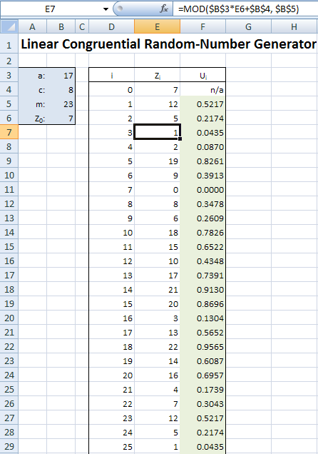
Figure 6.19: A linear congruential random-number generator implemented in Excel file
The LCG’s parameters \(a\), \(c\), \(m\), and \(Z_0\) are in cells B3..B6, and the spreadsheet is set up so that you can change them to other values if you’d like, and the whole spreadsheet will update itself automatically. Looking down at the generated \(U_i\) values in column F, it might appear at first that they seem pretty, well, “random” (whatever that means), but looking a little closer should disturb you. Our seed was \(Z_0 = 7\), and it turns out that \(Z_{22}=7\) as well, and after that, the sequence of generated numbers just repeats itself as from the beginning, and in exactly the same order. Try changing \(Z_0\) to other values (we dare you) to try to prevent your seed from reappearing so quickly. As you’ll find out, you can’t. The reason is, there are only so many integer remainders possible with the mod \(m\) operation (\(m\), in fact) so you’re bound to repeat by the time you generate your \(m\)th random number (and it could be sooner than that depending on the values of \(a\), \(c\), and \(m\)); this is called cycling of RNGs, and the length of a cycle is called its period. Other, less obvious issues with LCGs, even if they had long periods, is the uniformity and independence appearance we need, which are actually more difficult to achieve and require some fairly deep mathematics involving prime numbers, relatively prime numbers, etc. (number theory).
Several relatively good LCGs were created (i.e., acceptable values of \(a\), \(c\), and \(m\) were found) and used successfully for many years following their 1951 development in (Lehmer 1951), but obviously with far larger values of \(m\) (often \(m = 2^{31} - 1 = 2,147,483,547\), about 2.1 billion or on the order of \(10^9\)). However, computer speed has come a long way since 1951, and LCGs are no longer really serious candidates for high-quality RNGs; for one thing, an LCG with a period even as high as \(10^9\) can be run through its whole cycle in just a few minutes on common personal computers today. So other, different methods have been developed, though many still using the modulo remainder operation internally at points, with far longer periods and much better statistical properties (independence and uniformity). We can’t begin to describe them here; see (L’Ecuyer 2006) for a survey of these methods, and (L’Ecuyer and Simard 2007) for testing RNGs.
Simio’s RNG is the Mersenne twister (Matsumoto and Nishimura 1998) and it has a truly astronomical cycle length (\(10^{6001}\), and by comparison, it’s estimated that the observable universe contains about \(10^{80}\) atoms). And just as importantly, it has excellent statistical properties (tested independence and uniformity up to 632 dimensions). So in Simio, you at least have two fewer things to worry about — running out of random numbers, and generating low-quality random numbers.
As implemented in Simio, the Mersenne twister is divided into a huge number of hugely long streams, which are subsegments of the entire cycle, and it’s essentially impossible for any two streams to overlap. While you can’t access the seed (it’s actually a seed vector), you don’t need to since you can, if you wish, specify the stream to use, as an extra parameter in the distribution specification. For instance, if you wanted to use stream 28 (rather than the default stream 0) for the shifted lognormal that Stat::Fit fitted to our service-time data in Section 6.1, you’d enter 17.4+Random.Lognormal(2.04, 0.672, 28).
Why would you ever want to do this? One good reason is if you’re comparing alternative scenarios (say, different plant layouts), you’d like to be more confident that output differences you see are due to the differences in the layouts, and not due to just having gotten different random numbers. If you dedicate a separate stream to each input distribution in your model, then when you simulate all the plant-layout scenarios you’re doing a better job of synchronizing the random-number use for the various inputs across the different scenarios, so that there’s a better chance that each layout scenario will “see” the same jobs coming at it at the same times, the processing requirements for the jobs will be the same across the scenarios, etc. This way, you’ve at least partially removed “random bounce” as an explanation of the different results across the alternative scenarios.
Re-using random numbers in this way is one kind of a variance-reduction technique, of which there are several, as discussed in general simulation texts like (Banks et al. 2005) or (Law 2015); this particular variance-reduction technique is called common random numbers since we’re trying to use the same (common) random numbers for the same purposes across different scenarios. In addition to being intuitively appealing (comparing like with like, or apples with apples), there’s actually a probabilistic grounding for common random numbers. If \(Y_A\) and \(Y_B\) are the same output-performance RVs (e.g., total time in system) for scenarios \(A\) and \(B\), then for comparison we’re interested in \(Y_A - Y_B\), and \(Var(Y_A-Y_B) = Var(Y_A) + Var(Y_B) - 2Cov(Y_A,Y_B)\), where \(Cov\) denotes covariance. By using common random numbers, we hope to correlate \(Y_A\) and \(Y_B\) positively, making \(Cov(Y_A,Y_B) > 0\), and thus reducing the variance of the difference \(Y_A-Y_B\) in the outputs from what it would be if we ran the scenarios independently (in which case \(Cov(Y_A,Y_B)\) would be 0. If you’re making multiple replications of your different scenarios, Simio also arranges for each replication across each of the scenarios to start at the same point within all the streams you might be using, so that synchronizing the use of the common random numbers stays intact even after the first replication. Also, when running multiple scenarios in Simio, it will start each scenario at the beginning of each random-number stream you’re using.
One important thing to realize about all random-number generators is that they aren’t really random at all, in the sense of being unpredictable. If you have a fixed algorithm for the generator, and use the same seed value (or seed vector, as is the case with the Mersenne twister), you’ll of course get exactly the same sequence of “random” numbers. For this reason, they’re sometimes called pseudo-random, which is technically a more correct term. So in simulation software like Simio, if you simply re-run your model you’ll get exactly the same numerical results, which often surprises people new to simulation since it seems that this shouldn’t happen when using a random-number generator. However, if you replicate your model multiple times within the same run, you’ll just keep marching through the random-number stream(s) from one replication to the next so will get different and independent results, which is what’s needed for statistical analysis of the output data from simulation. Actually, the fact that you get the same results if you re-run the same model is quite useful, e.g. for debugging.
6.4 Generating Random Variates and Processes
In Sections 6.1 and 6.2 we discussed how to choose probability distributions for the stochastic inputs to your model, and in Section 6.3 we described how random numbers (continuously uniformly distributed between 0 and 1) are generated. In this section we’ll combine all that and discuss how to transform the uniform random numbers between 0 and 1 into draws from the input distributions you want for your model. This is often called random-variate generation. When using Simio, this is taken care of for you internally, at least for the approximately 20 distributions it supports. But it’s still important to understand the basic principles, since you may find that you need to generate variates from other distributions on occasion.
Actually, we’ve already discussed random-variate generation for a few special cases in Chapter 3. In Section 3.2.3 we needed to generate discrete random variates distributed uniformly on the integers \(1000, 1001, \ldots, 5000\). In Section 3.2.4 we required random variates from the continuous uniform, lognormal, and Weibull distributions. And in Section 3.3.2 we needed to generate continuous random variates from exponential distributions. In each of these cases we devised distribution-specific methods, and in the discrete-uniform case, at least, there was reasonable intuition about why that method was correct (in the other cases, we just referred you here to this section, so this is the place).
There are some general principles, though, that provide guidance in figuring out how to transform random numbers into random variates from the input distributions you want. Probably the most important one is called inverse CDF since it involves finding the functional inverse (not the algebraic inverse or reciprocal) of the CDF \(F_X\) of your desired input distribution (\(X\) is the corresponding RV; we often subscript CDFs, PDFs, and PMFs with the pertinent RV just to clarify). As a reminder, the CDF gives you the probability that the associated RV will be less than or equal to its argument, i.e., \(F_X(x) = P(X \le x)\) where the RV \(X\) has CDF \(F_X\).
First consider a continuous RV \(X\) with CDF \(F_X\) that’s a continuous function. The basic idea is to generate a random number \(U\), set \(U = F_X(X)\), and try to solve that equation for \(X\); that solution value \(X\) will be a random variate with CDF \(F_X\), as we’ll show in the next paragraph. We say “try to” solve because, depending on the distribution, solving that equation may or may not be simple. We denote its solution (simple or not) as \(X = F_X^{-1}(U)\), where \(F_X^{-1}\) is the functional inverse of \(F_X\), i.e., \(F_X^{-1}\) “undoes” whatever it is that \(F_X\) does.
Why does this work, i.e., why does the solution \(X = F_X^{-1}(U)\) have distribution with CDF \(F_X\)? The key is that \(U\) is continuously uniformly distributed between 0 and 1, and we do need to rely on the quality of the random-number generator to guarantee that that’s at least very close to being true. If you take any subinterval of \([0,1]\), let’s say \([0.2, 0.6]\), the probability that the random number \(U\) will fall in the subinterval is the width of the subinterval, in this case \(0.6 - 0.2 = 0.4\); to see this, just remember that the PDF of \(U\) is
\[\begin{equation*} f_U(x) = \left\{ \begin{array}{ll} 1 & \textrm{if } 0 \le x \le 1\\ 0 & \textrm{otherwise} \end{array} \right. \end{equation*}\]
and that the probability that an RV lands in an interval is the area under its PDF over that interval (see Figure 6.20).
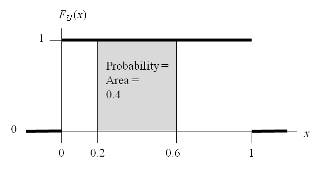
Figure 6.20: PDF of the continuous uniform distribution.
So in particular, for any value \(w\) between 0 and 1, \(P(U \le w) = w\). So, starting with the “generated” variate \(X = F_X^{-1}(U)\), let’s find the probability that it’s less than or equal to any value \(x\) in the range of \(X\):
\[\begin{array}{lcll} P(F_X^{-1}(U) \le x) & = & P(F_X(F_X^{-1}(U)) \le F_X(x)) &(\textrm{apply }F_X,\textrm{ an increasing}\\ & & &\textrm{function, to both sides})\\ \\ & = & P(U \le F_X(x)) &(\textrm{definition of functional}\\ & & &\textrm{inverse})\\ \\ & = & F_X(x). &(U\textrm{ is uniformly distributed}\\ & & &\textrm{between 0 and 1, and}\\ & & &F_X(x)\textrm{ is between 0 and 1}) \end{array}\]
This shows that the probability that the generated variate \(X = F_X^{-1}(U)\) is less than or equal to \(x\) is \(F_X(x)\), i.e., the generated variate has CDF \(F_X(x)\), exactly as desired. Figure 6.21 illustrates the inverse CDF method in the continuous case, with two random numbers \(U_1\) and \(U_2\) plotted on the vertical axis (they’ll always be between 0 and 1, so will always fit within the vertical range of any CDF plot, since it too is between 0 and 1), and the corresponding generated variates \(X_1\) and \(X_2\) are on the \(x\) axis, in the range of the CDF \(F_X(x)\) (this particular CDF appears to have a range of all positive numbers, like the gamma or lognormal distributions). So the inverse-CDF pictorially amounts to plotting random numbers on the vertical axis, then reading across to the CDF (which could be to either the left or the right, though it’s always to the right in our example since the RV \(X\) is always positive), and then down to the \(x\) axis to get the generated variates. Note that bigger random numbers yield bigger random variates (since CDFs are nondecreasing functions, their functional inverses are too). Also, since the random numbers are distributed uniformly on the vertical axis between 0 and 1, they’ll be more likely to “hit” the CDF where it’s rising steeply, which is where its derivative (the PDF) is high — and this is exactly the outcome we want, i.e., the generated RVs are more dense where the PDF is high (which is why the PDF is called a density function). So the inverse-CDF method deforms the uniform distribution of the random numbers according to the distribution of the RV \(X\) desired.
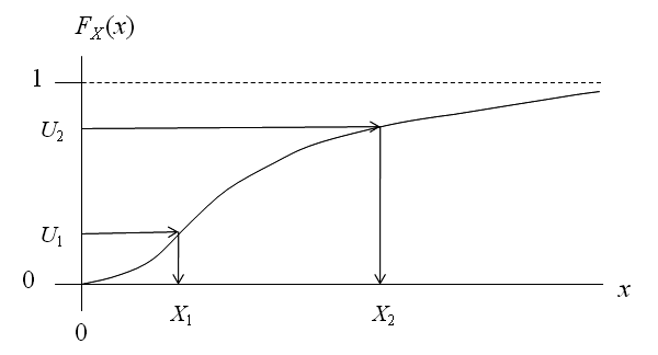
Figure 6.21: Illustration of the inverse CDF method for continuous random-variate generation.
To take a particular example, the same distribution we used in Section 3.3.2, suppose \(X\) has an exponential distribution with mean \(\beta > 0\). As you can look up in any probability/statistics book, the exponential CDF is \[\begin{equation*} F_X(x) = \left\{ \begin{array}{ll} 1 - e^{-x/\beta} & \textrm{if } x \ge 0\\ 0 & \textrm{otherwise} \end{array} \right. \end{equation*}\] so setting \(U = F_X(X) = 1 - e^{-X/\beta}\) and solving for \(U\), a few lines of algebra yields \(X = -\beta\ln(1-U)\) as the variate-generation recipe, just as we got in Section 3.3.2. In the case of this exponential distribution, everything worked out well since we had a closed-form formula for the CDF in the first place, and furthermore, the exponential CDF was easily inverted (solving \(U = F_X(X)\) for \(X\)) via simple algebra. With other distributions there might not even be a closed-form formula for the CDF (e.g., the normal) so we can’t even start to try to invert it with algebra. And for yet other distributions, there might be a closed-form formula for the CDF, but inverting it isn’t possible analytically (e.g., the beta distribution with shape parameters’ being large integers). So, while the inverse CDF always works for the continuous case in principle, implementing it for some distributions could involve numerical methods like root-finding algorithms.
In the discrete case, the inverse-CDF idea is the same, except the CDF is not continuous — it’s a piecewise-constant step function, with “riser” heights of the steps equal to the PMF values above the corresponding possible values of the discrete RV \(X\). Figure 6.22 illustrates this, where the possible values of the RV \(X\) are \(x_1, x_2, x_3, x_4\). So implementing this generally involves a search to find the right “riser” on the steps. If you think of projecting the step heights leftward onto the vertical axis (all between 0 and 1, of course), what you’ve done is divide the (vertical) interval \([0,1]\) into subsegments of width equal to the PMF values. Then generate a random number \(U\), search for which subinterval on the vertical axis contains it, and the corresponding \(x_i\) is the one you return as the generated variate \(X\) (\(X = x_3\) in the example of Figure 6.22). Actually, the custom method we devised in Section 3.2.3 to generate the discrete uniform demands is the discrete inverse-CDF method, just implemented more efficiently as a formula rather than as a search. Such special “tricks” for some distributions are common, and sometimes are equivalent to the inverse CDF (and sometimes not).
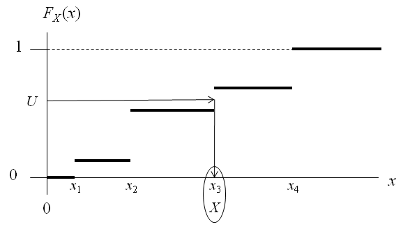
Figure 6.22: Illustration of the inverse CDF method for discrete random-variate generation.
Inverse CDF is, in a way, the best variate-generation method, but it is not the only one. There has been a lot of research on variate generation, focusing on speed, accuracy, and numerical stability. For overviews of this topic see, for example, (Banks et al. 2005) or (Law 2015); a thorough encyclopedic treatment can be found in (Devroye 1986). We briefly discussed specifying random vectors and process in Section 6.1.6, and for each one of those cases, we also need to think about how to generate (realizations of) them. Discussing these methods is well beyond our scope in this book, and the references in the preceding paragraph could be consulted for many situations. As mentioned in Section 6.2.3, Simio has a built-in method for an important one of these cases, generating nonstationary Poisson processes when the rate function is piecewise linear. However, in general, simulation-modeling software does not yet support general methods for generating correlated random variables, random vectors with multivariate distributions, or general random processes.
6.5 Using Simio Input Parameters
In this section we’ll describe Simio’s Input Parameters and how to use them to simplify modeling and improve input analysis. Input Parameters provide an alternate method for characterizing and specifying input data compared to entering an expression directly into the corresponding object instance properties as we’ve done so far.
We’ll use the simple three-station serial Model 6-2 in Figure 6.23 to demonstrate and discuss Simio Input Parameters. The four inputs of interest are the entity interarrival times and the processing times at each of the three servers. The standard method that we’ve used previously would be to enter the inputs directly into the object instances — e.g., setting the Interarrival Time property for Source1 to something like Random.Exponential(2.5) minutes, and the Processing Time properties for the servers to something like Random.Triangular(1, 2.25, 3) or 1+Random.Lognormal(0.0694, 0.5545) minutes. Instead, for Model 6-2 we’ll define an individual Input Parameter for each of the four inputs and then specify the Input Parameter in the corresponding object instance property. All nodes in this model are connected with Time Paths with 30-second (deterministic) Travel Time properties. By using Time Paths, the model results will be insensitive to the physical path objects’ lengths.
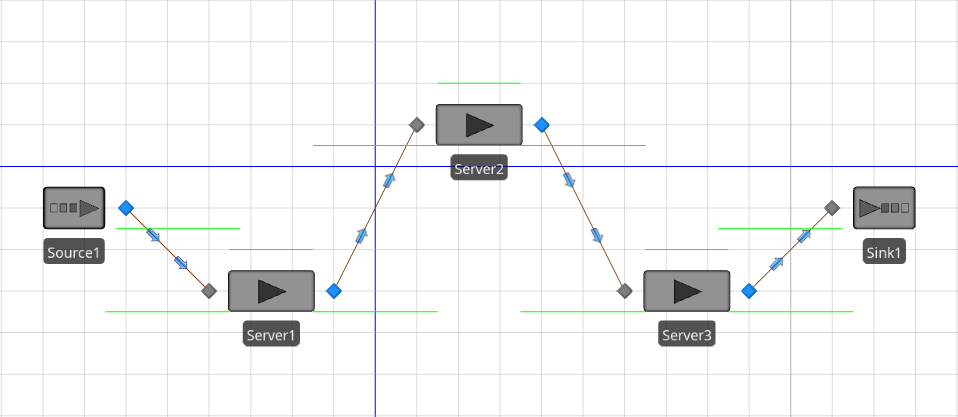
Figure 6.23: Model 6-2 - Three servers in series using Input Parameters.
Figure 6.24 shows the completed Input Parameters definitions for Model 6-2. Note that the Input Parameter definitions page is on the Data tab for the Model object. The main window is split horizontally — the top part shows all four of the defined Input Parameters, and the bottom part shows a sample histogram for the selected parameter (note that there is no histogram displayed for Expression-type or Table-type parameters). The Properties window shows the properties for the selected Input Parameter. In Figure 6.24, the PTimes1 parameter (the processing time parameter for Server1) is selected, so its histogram and properties are displayed in the corresponding windows. In Model 6-2, we’ll use EntityArrivals for the entity interarrival times and PTimes1, PTimes2, and PTimes3 for the processing times for Server1, Server2, and Server3, respectively.
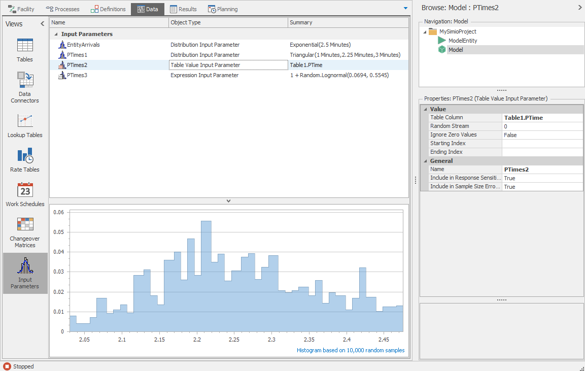
Figure 6.24: Input Parameters definitions for Model 6-2.
Simio currently supports three different types of Input Parameters:
Distribution – You specify the distribution and associated parameters to use. The PTimes1 Input Parameter for Model 6-2 (shown in Figure 6.24) defines a triangular distribution with parameters (1, 2.25, 3), all in minutes, and the histogram shown in the bottom part of the window is based on 10,000 random draws from this distribution; the purpose of this histogram is to provide the modeler with a quick check that these values will have the general range and distribution shape intended when generated later as model input during the simulation runs. The Number of Data Samples property is set to 300, indicating that we used 300 observed real-world observations of the phenomenon to fit this distribution; we discuss this property and its use in Section 6.5.2.
The EntityArrivals parameter (Properties not shown) is also a distribution-type parameter defining the interarrival times between successive arriving entities to follow an exponential distribution with mean 2.5 minutes, and also based on 300 observed real-world observations.
In terms of generating draws during the simulation, using a distribution-type Input Parameter is operationally equivalent to using the distribution expression directly with an object instance, as we’ve discussed earlier in this chapter. However, defining it instead as a Simio Input Parameter in this way provides the ability to re-use it at multiple points in the model, as well as to take advantage of Sensitivity Analysis and Sample Size Error estimation with respect to it, discussed in Sections 6.5.1 and 6.5.2.
Table Value –You specify a table column that contains a set of values from which to sample. The Table Column property specifies the data table and column that contains the data points (Table1.PTime in this case). The histogram for table data is not shown in the Input Parameters window, but can be viewed using the data table Histogram Tool described in Section 7.1.1.
When specifying this Table Value type of Input Parameter, samples are drawn randomly from these values in the Table column for this histogram, as well as during the actual simulation run for use in driving the model, rather than fitting or empirically specifying a distribution. So each generated variate will technically always be equal to one of the observations from a discrete (not continuous) distribution with possible values being all the distinct data points in the table column, and their probabilities’ of being generated being the number of times they appear in that table column, divided by the number of values in the table column (300 in our example). If you look in Table1 in Model 6-2, in the PTime column (the only one there), you’ll find, for instance, that the value 2.21 appears 17 times, so that 2.21 will be generated with probability \(17/300 = 0.0567\) in this histogram as well as during the simulation. On the other hand, the value 2.48 appears only once so will be generated with probability \(1/300 = 0.0033\). Moreover, this value 2.48 happens to be the largest value in this column/dataset so no values greater than 2.48 can ever be generated, which may (or may not) be of concern to the modeler, depending on the model context, and whether right-tail properties of the distribution are important.
So, there is no distribution-fitting or goodness-of-fit testing when using this type of Input Parameter. Some researchers have suggested (B. L. Nelson 2016) the possibility of this approach (perhaps especially when distribution-fitting does not produce a distribution that appears to fit the data acceptably), since there is no concern about a poor fit to the data since you’re not “fitting” anything, provided that the sample size of observed real-world observations in the table column is reasonably large, and is believed to cover the correct range of values to be generated. However, if the tails of the distribution are important (e.g., in service-time distributions where the right tail can be important) then capping the generated values at the maximum observed value in the data set could be problematic for model validity, in that no extremely large service times (greater than the maximum observed in the real-world data) can ever be generated, which might downwardly bias congestion output metrics.
Expression – You specify an expression to use for the sampling. As shown in Figure 6.24 the PTimes3 parameter is an expression-type parameter uses the expression 1 + Random.Lognormal(0.0694, 0.5545). For this type of parameter, samples are generated by simply evaluating the expression (in this case, sampling from a shifted lognormal distribution). Note that there is no histogram of 10,000 sample values provided with this type of Input Parameter.
In order to use an Input Parameter with an object instance, simply enter the Input Parameter name as the corresponding property value (see Figure 6.25).
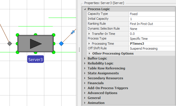
Figure 6.25: Server3 with the Processing Time property value set to PTimes3 (the Input Parameter name) in Model 6-2.
Note that you can also right-click on the property name and use the Set Input Parameter list from the context menu (similar to the method for setting Reference Properties). In Model 6-2, we made the corresponding Input Parameter property assignments for Source1, Server1, and Server2.
Using Input Parameters can simplify modeling by allowing you to use the same expressions for multiple inputs, but the more important use of them involves the input analyses discussed in the following two sections. Simio’s Response Sensitivity (Section 6.5.1) analysis provides a measurement of the sensitivity of each experiment response to each of the Input Parameters; you would typically use this analysis before significant “real-world” data in model inputs are collected as a guide to help you allocate your data-collection efforts (some inputs may be more important to model responses than other inputs). Simio’s Sample Size Error Estimation (Section 6.5.2) analysis uses a confidence-interval-based approach to estimate the overall impact of estimated (and thus uncertain) Input Parameters on the uncertainty in the experiment responses.
6.5.1 Response Sensitivity
Simio’s Response Sensitivity analysis ((Song, Nelson, and Pegden 2014), (Song and Nelson 2015)) uses linear regression to relate (approximately) each experiment response to the set of Input Parameters. In statistical regression-analysis terminology, the response is the dependent \(Y\) variable on the left-hand side of the regression equation, and the Input Parameters are the various \(X_j\) explanatory variables on the right-hand side. The calculated sensitivities are approximate predictions of how the chosen experiment response in the model would be changed by a unit positive change (i.e., change equal to \(+1\), in whatever the measurement units are for this \(X_j\)) in that Input Parameter while holding all other Input Parameters constant; thus, these sensitivities are the fitted linear-regression \(\hat{\beta}_j\) coefficients or slope estimates. For Simio to be able to perform this Response Sensitivity analysis, the number of replications in the experiment must be strictly greater than the number of Input Parameters used in the model, to ensure that there are enough degrees of freedom to fit the regression model; however, no additional replications beyond those you’ve already made are required to do this Response Sensitivity (provided that the number of replications exceeds the number or Input Parameters), and Simio automatically performs this analysis. Response Sensitivity is akin to what have been called regression metamodel approximations of simulation models. This analysis can be useful for determining which inputs should be allocated further study or data collection, perhaps in cases where limited or no “real-world” data are available.
Model 6-2 includes two experiment responses: NIS (time-average Number In System) and TIS (average Time In System) . In case you forgot, this can be done using the expressions DefaultEntity.Population.NumberInSystem.Average and DefaultEntity.Population.TimeInSystem.Average. Figure 6.26 shows the aptly-named Tornado Chart view of the Response Sensitivity analysis for the TIS response in Model 6-2 (based on an experiment with \(100\) replications of length \(500\) simulated hours each). Note that Bar Chart, Pie Chart, and Raw Data views are also available, as alternatives to Tornado Charts, using the tabs across the lower edge of the chart. Going from top to bottom, the Tornado Chart orders the Input Parameters in decreasing order of absolute sensitivity for each experiment response, with blue horizontal bars’ extending to the left of the vertical zero line indicating negative sensitivity coefficients, and bars’ extending to the right indicating positive sensitivity coefficients. You can mouse-hover over an individual bar and a tool tip will pop up to show the actual numerical sensitivity coefficient value for the corresponding Input Parameter and experiment response, as approximated by the fitted linear-regression model. The Bar Charts and Pie Charts provide the same information in different graphical formats and the Raw Data view gives the data used to construct the charts.
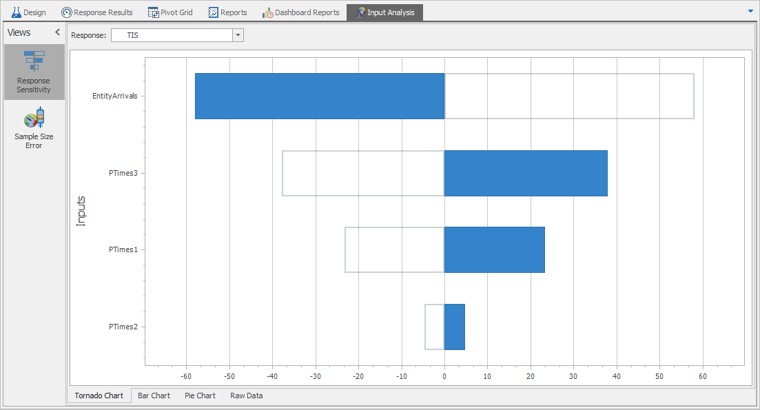
Figure 6.26: TIS Response Sensitivity analysis for Model 6-2.
From the Tornado Chart, we see that this TIS response is relatively (compared to the other three Input Parameters) highly sensitive to EntityArrivals in a negative way (i.e., TIS falls relatively substantially as EntityArrivals rises). The TIS response is relatively sensitive to PTimes3 (processing times at Server3) in a positive way, i.e., TIS increases relatively markedly as PTimes3 increases. Further, TIS is relatively fairly sensitive to PTimes1 (processing times at Server 1) in a positive way. Finally, TIS is relatively insensitive to PTimes2 (processing times at Server2). Thus, if you wanted to expend additional effort collecting more re-world data to improve your input probability distributions (and thus the quality/validity of your output performance metrics), this Tornado Chart tells you that your efforts would be best spent on getting more data and better estimates of EntityArrivals and PTimes3, maybe some effort on collecting more data on PTimes1, but not much effort on additional data on PTimes2. This is only for the TIS Response, but you could repeat it for the other responses by choosing them in the pull-down on the right of the Responses field at the top (or, select Bar or Pie Charts to see all Responses at once).
As mentioned, if you mouse-hover over the horizontal blue sensitivity bars in Figure 6.26, the numerical values for the fitted linear-regression \(\hat{\beta}_j\) coefficient estimates in the regression to predict the TIS response pop up:
EntityArrivals: -54.843
PTimes3: 18.225
PTimes1: 7.930
PTimes2: -0.814
(in the same order as in Figure 6.26). In interpreting these numbers, it’s important to keep in mind the units of measurement of everything, as well as the meaning of such linear-regression estimated coefficients. In this model, all four of the inputs, as well as the TIS response, are times, and all have minutes as their units of measurement. So the background regression (meta-)model of the simulation model is predicting that a one-minute increase in the input PTimes1 will increase the output TIS by something like 7.930 minutes; likewise, a one-minute increase in EntityArrivals will decrease (since this coefficient is negative) TIS by a predicted 54.843 minutes. If we wanted to change the units on TIS to, say, hours, then a one-minute increase in PTimes1 will increase TIS by \(7.930/60 = 0.132\) hours. Likewise, if you instead change the units on the input PTimes1 to hours, then the regression would change its fit (and units on the estimated \(\hat{\beta}_j\) coefficients) so that a one-unit (now one-hour) increase in PTimes1 is predicted to increase TIS by about \(60\times 7.930 = 475.8\) minutes. So the number \(7.930\) has to be interpreted within the units of the selected response and Input Parameters. If you had other Input Parameters in the model that were not times (maybe a batch size of an incoming batch) then its estimated \(\hat{\beta}_j\) coefficient in the regression would be numerically interpreted as the increase in TIS (in minutes unless you change its units) owing to a one-unit increase in the batch size (however you’re measuring “batch size” in these “units”). No matter what the Input Parameters represent (times, batch sizes, whatever), the fitted numerical regression coefficient must be interpreted as the effect on the response (it its units) owing to a one-unit increase in the corresponding Input Parameter (in its units, whatever they are). And, of course, as always in regression, this is only a marginal effect, i.e. like a ceteris paribus (holding all other Input Parameters constant at their current values) partial derivative. Another caution is that you cannot safely extrapolate too far outside the realm of the real-world observations you have on the respective Input Parameters, since a linear regression is merely a local linear approximation to a response that may be (and likely is, in simulation) very nonlinear. Moreover, these Response Sensitivities are merely approximate predictions of how this response from your simulation model might react if you made these +1 unit changes (one at a time) in the Input Parameters — if you actually run your simulation with such a change in your input parameter you will likely get something somewhat different, but that obviously requires running your simulation again (which might take a while if it’s large, complicated, or if you’re making many or long replications), whereas these Response Sensitivity estimated predictions are instant (and free in the sense that they’re automatically produced by your initial simulation run).
By the way, the signs of the Response Sensitivities in Figure 6.26 are entirely intuitive. This TIS response is the mean time in system of entities, one of several congestion output metrics of queueing systems (other such metrics include the time-average number of entities in system, and the utilization of the servers). The Input Parameter EntityArrivals refers to the inter-arrival times between successive entities to the system (and not the arrival rate, which is the reciprocal of the mean interarrival time), and so if the interarrival times were to increase (with a \(+1\) change in this Input Parameter), this means that entities would be showing up spaced further apart in time, which will naturally decrease (negative change) congestion in the system. On the other hand, the other three Input Parameters all refer to the service times (not service rates), and if we were to increase service times then we would expect that system congestion would increase (positive change). Thus, the signs (positive or negative) of these Response Sensitivities might provide a quick check on your model’s validity (not to mention the correctness of your Simio “code”); surprises in the signs of Response Sensitivities, however, might not necessarily prove that there’s something wrong with your model or code, but might warrant further investigation (maybe such a “surprise,” if not the result of a modeling or coding error, might teach you something new about your model/system). While it’s true that the signs of the Response Sensitivities are often intuitive and thus guessable, their magnitudes are generally not guessable, so there could be considerable value in having them quickly approximately quantified like this.
6.5.2 Sample Size Error Estimation
The second type of input analysis supported by Simio’s Input Parameters involves sample size error estimation. The Simio implementation is based on the work described in (Song and Nelson 2015). As we’ve mentioned before in the book, and will mention more later, stochastic simulations (which take as input realizations from probability distributions or other random processes, not just deterministic input constants) yield results that are themselves uncertain. One of the important parts of a sound simulation study is assessing this output uncertainty, and using appropriate statistical methods to take it into account (or reduce it) on the way to producing valid, reliable, and precise conclusions about the target real-world system being simulated. We generally focus on the simulation-experimental uncertainty (simulation-sampling error since we can’t make infinitely many replications) inherent in the given model structure, including generating (or realizing) input random variates from the probability distributions that we’ve specified, via the methods discussed in this chapter.
For instance, in Model 6-2 we specified the processing (service) times at Server2 to be Triangular(1 Minutes, 2.25 Minutes, 3 Minutes), based on having fit this distribution to a sample of 300 real-world observations on this service time. In statistical output analysis we often focus on the standard deviations (or confidence-interval half-widths) of an output performance-metric response (like TIS, the mean time in system), and to reduce that imprecision we could do more (or longer) replications of the model than the 100 replications of length 500 simulated hours each that we did. But this assumes that all the input probability distributions (like this triangular distribution with parameters (1, 2.25, 3) minutes) are really exactly right, including the numerical values (1, 2.25, 3), vis-`a-vis the target real-world system. So we’re actually making a conditional uncertainty assessment, conditional on all the input distributions’ and parameters’ being really exactly right as they’ve been estimated. But, of course, such input distributions (and their parameters) aren’t really really exactly right, in the larger sense of unconditional variance of our output metrics vs. the real-world target system of interest. So when we get our results, some of the uncertainty we have in them vs. the real-world target system is due to the built-in structural uncertainty (and input distributions) in the given model, and some of it is due to our having gotten those input distributions (including their parameters) at least somewhat wrong in the first place (in this example, we had only 300 data points, not an infinite number). Simio’s Sample Size Error Estimation quantifies this, and might guide your further efforts in terms of additional simulation runs, or additional real-world data collection, to reduce your overall unconditional uncertainty.
Figure 6.27 shows the Sample Size Error Estimation analysis for the NIS (mean number of entities in system) response in Model 6-2. Note that, unlike Response Sensitivity analysis discussed earlier, Sample Size Error Estimation analysis requires additional model runs and is not run automatically as part of an experimental run. Use the Run Analysis item from the Sample Size Error ribbon to run this analysis. The output shown in Figure 6.27 includes three components:
The Half-Width Expansion Factor (this value is \(5.56\) for this NIS response in Model 6-2), meaning that we have about 5.56 times as much uncertainty from the inputs’ being estimated (as opposed to known with certainty) as we do from the model’s being run for only finitely many replications;
A bar chart that shows the relative percentage of overall unconditional uncertainty contribution attributable to each Input Parameter, so uncertainty about EntityArrivals is the biggest cause of uncertainty relative to the other two inputs;
An expanded SMORE plot (tan) that overlays an expanded confidence interval (blue) due to uncertainty caused by estimating (rather than knowing with certainty) the input parameters.
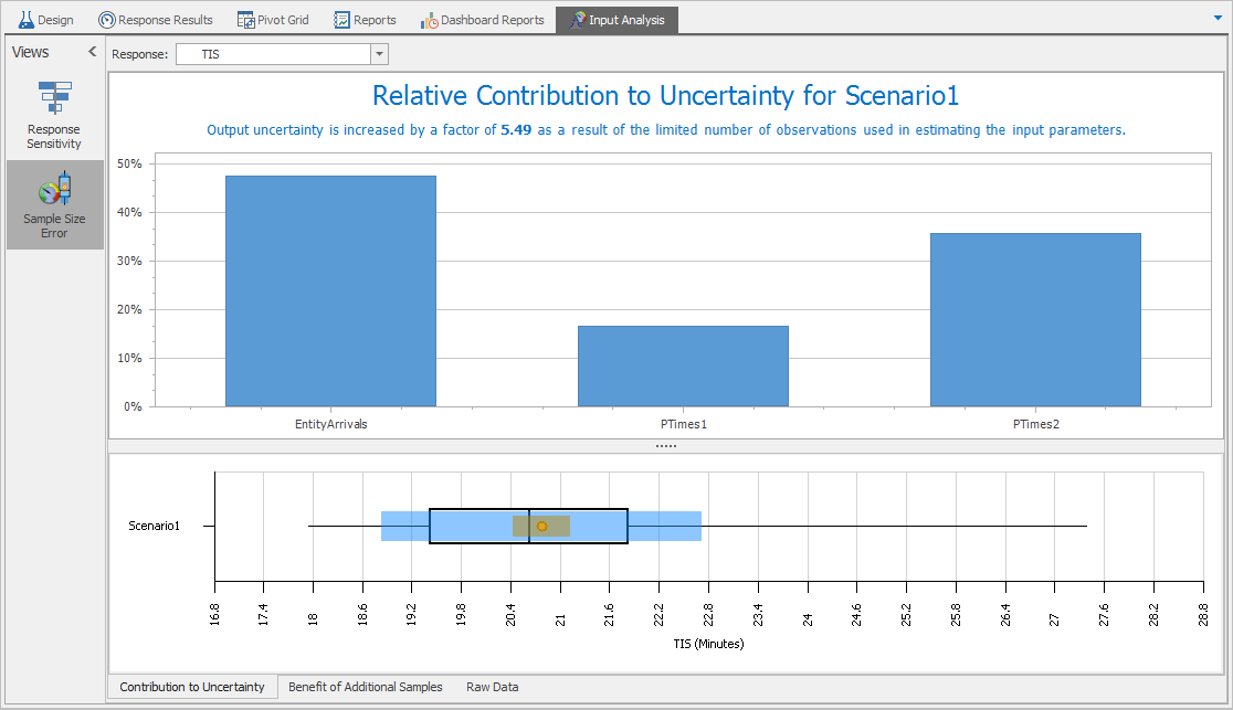
Figure 6.27: Sample size error analysis for the NIS response in Model 6-2.
Mouse-hovering over the standard SMORE confidence interval (the tan box) gives the confidence interval half-width as \(0.1492\) and mouse-hovering over the expanded confidence interval (the blue box) gives the expanded confidence interval half-width as \(0.8291\). The expansion factor indicates that the input-related uncertainty (caused by estimating the input probability distributions as opposed to knowing them with certainty) is approximately \(0.8291/0.1492 \approx 5.56\) times as large as the experimental uncertainty (i.e., sampling error from running only a finite number of replications). Thus, our major uncertainty problem is not so much that we haven’t run the simulation for enough replications (or long enough), but rather that our sample size of 300 from the real world is not enough to provide sufficiently precise definitions of the input probability distributions. So our next move to improve precision in estimating the real-world NIS performance might not be to run more or longer replications of our current simulation model, but rather to go back to the field and collect more data on the input distributions, perhaps especially on EntityArrivals, and refine the Input Parameter definitions accordingly.
6.6 Problems
The Excel file
Problem_Dataset_06_01.xls, available for download as described in Appendix C, contains 42 observations on interarrival times (in minutes) to a call center. Use Stat::Fit (or other software) to fit one or more probability distributions to these data, including goodness-of-fit testing and probability plots. What’s your recommendation for a distribution to be used in the simulation model from which to generate these interarrival times? Provide the correct Simio expression, heeding any parameterization-difference issues.The Excel file
Problem_Dataset_06_02.xls, available for download as described in Appendix C, contains 47 observations on call durations (in minutes) at the call center of Problem 1. Use Stat::Fit (or other software) to fit one or more probability distributions to these data, including goodness-of-fit testing and probability plots. What’s your recommendation for a distribution to be used in the simulation model from which to generate these call-duration times? Provide the correct Simio expression, heeding any parameterization-difference issues.The Excel file
Problem_Dataset_06_03.xls, available for download described in Appendix C, contains 45 observations on the number of extra tech-support people (beyond the initial person who originally took the call) needed to resolve the problem on a call to the call center of Problems 1 and 2. Use Stat::Fit (or other software) to fit one or more probability distributions to these data, including goodness-of-fit testing and probability plots. What’s your recommendation for a distribution to be used in the simulation model from which to generate the number of extra tech-support people needed for a call? Provide the correct Simio expression, heeding any parameterization-difference issues.Derive the inverse-CDF formula for generating random variates from a continuous uniform distribution between real numbers \(a\) and \(b\) (\(a < b\)).
Derive the inverse-CDF formula for generating random variates from a Weibull distribution. Look up its definition (including its CDF) in one of the references, either book or online, cited in this chapter. Check the Simio definition in its documentation to be sure you have your formula parameterized properly.
Derive the inverse-CDF formula for generating triangular variates between \(a\) and \(b\) with mode \(m\) (\(a<m<b\)). Take care to break your formula into different parts, as needed. Check the Simio definition in its documentation to be sure you have your formula parameterized properly.
Recall the general inverse-CDF method for generating arbitrary discrete random variates, discussed in Section 6.4 and shown in Figure 6.22. Let \(X\) be a discrete random variable with possible values (or support) 0, 0.5, 1.0, 1.5, 2.0, 3.0, 4.0, 5.0, 7.5, and 10.0, with respective probabilities 0.05, 0.07, 0.09, 0.11, 0.15, 0.25, 0.10, 0.09, 0.06, and 0.03. Compute the exact (to four decimal places) expected value and standard deviation of \(X\). Then, write a program in your favorite programming language, or use Excel, to generate first \(n = 100\) and then a separate \(n = 1000\) IID variates, and for each value of \(n\), compute the sample mean and standard deviation and compare with the exact values by both error and percent error; comment. Use whatever random-number generator is built-in or convenient, which is good enough for this purpose. If you use Excel, you might consider the VLOOKUP function.
Re-do the produce-stand spreadsheet simulation (Problem 18 from Chapter 3), but now use more precise probability mass functions for daily demand; Walther has taken good data over recent years on this, and he also now allows customers to buy only in certain pre-packaged weights. For oats, use the distribution in Problem 7 in the present chapter; note that the pre-packaged sizes are (in pounds), 0 (meaning that a customer chooses not to buy any packages of oats), 0.5, 1.0, 1.5, 2.0, 3.0, 4.0, 5.0, 7.5, and 10.0. For peas, the pre-packaged sizes are 0, 0.5, 1.0, 1.5, 2.0, and 3.0 pounds with respective demand probabilities 0.1, 0.2, 0.2, 0.3, 0.1, and 0.1. For beans, the pre-packaged sizes are 0, 1.0, 3.0, and 4.5 pounds with respective demand probabilities 0.2, 0.4, 0.3, and 0.1. For barley, the pre-packaged sizes are 0, 0.5, 1.0, and 3.5 pounds with respective demand probabilities 0.2, 0.4, 0.3, and 0.1. Refer to Problem 7 in the present chapter for the method to generate simulated daily demands on each product.
Write out a step-by-step algorithm, using only random numbers as input, to generate a random variate representing the interest paid on a monthly credit-card bill. There’s a 60% chance that the interest will be zero, i.e., the cardholder pays off the entire balance by the due date. If that doesn’t happen, the interest paid is a uniform random variate between $20 and $200. Then, develop a Simio expression to accomplish this, using relevant built-in Simio random-variate expressions.
Show that the method developed in Section 3.2.3 for generating demands for hats distributed uniformly on the integers \(1000, 1001, \ldots, 5000\) is exactly the same thing as the inverse-CDF algorithm for this distribution, except implemented more efficiently in a search-free way.